👷 Summary:
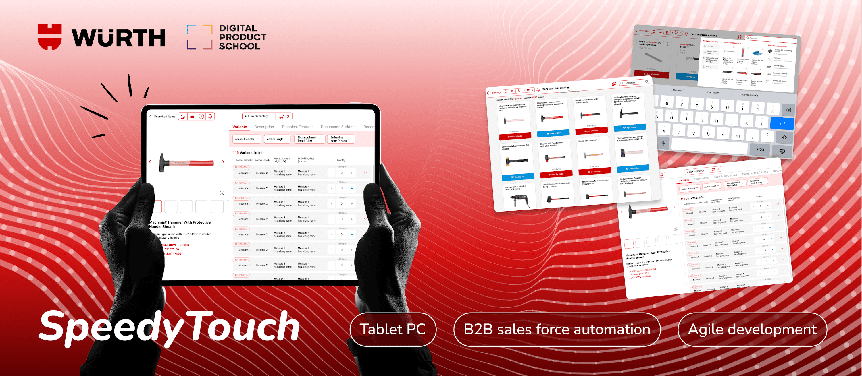
Wurth is a world leading manufacturer and seller of fastening and assembly products. SpeedyTouch is a software (on Tablet PC) used by Würth's sales representatives for customer visits everyday.
However, a distinctive pain point emerged: instead of searching for new products directly within SpeedyTouch, users frequently switched to Würth's online shopping website to fulfill customer requests. This behavior disrupted the flow of customer interactions and created inefficiencies.
To address this challenge, our team conducted an in-depth investigation into user behavior and identified key areas for improvement. We reimagined the user journey by grouping product variants and restructuring the process into 4 connected stages: displaying search previews, retrieving search results, navigating to product detail pages, and adding items to the cart. Through agile, cross-functional collaboration, we delivered a functional MVP within 12 weeks.
The results were highly promising: user testing revealed an 8.6/10 willingness-to-use score for our proposed solution. Additionally, the product garnered strong stakeholder satisfaction, leading to an invitation to present our solution to Würth's Executive Management Team (EMT).
Context
Digital Product School by UnternehmerTUM
Digital Product School is a program within UnternehmerTUM - Europe’s leading centre for innovation and business creation in cooperation with Zentrum Digitalisierung Bayern. DPS connects cross-disciplinary teams with industrial organisations to provide practical solutions in terms of building digital products in a vibrant start-up environment.
(It's NOT a bootcamp, I was selected through application and got paid:)
Würth Group
The Würth Group is the global market leader in the development, production, and sale of fastening and assembly materials. The Würth Group operates worldwide and currently consists of more than 400 companies with more than 2,800 branches and shops in 80 countries.
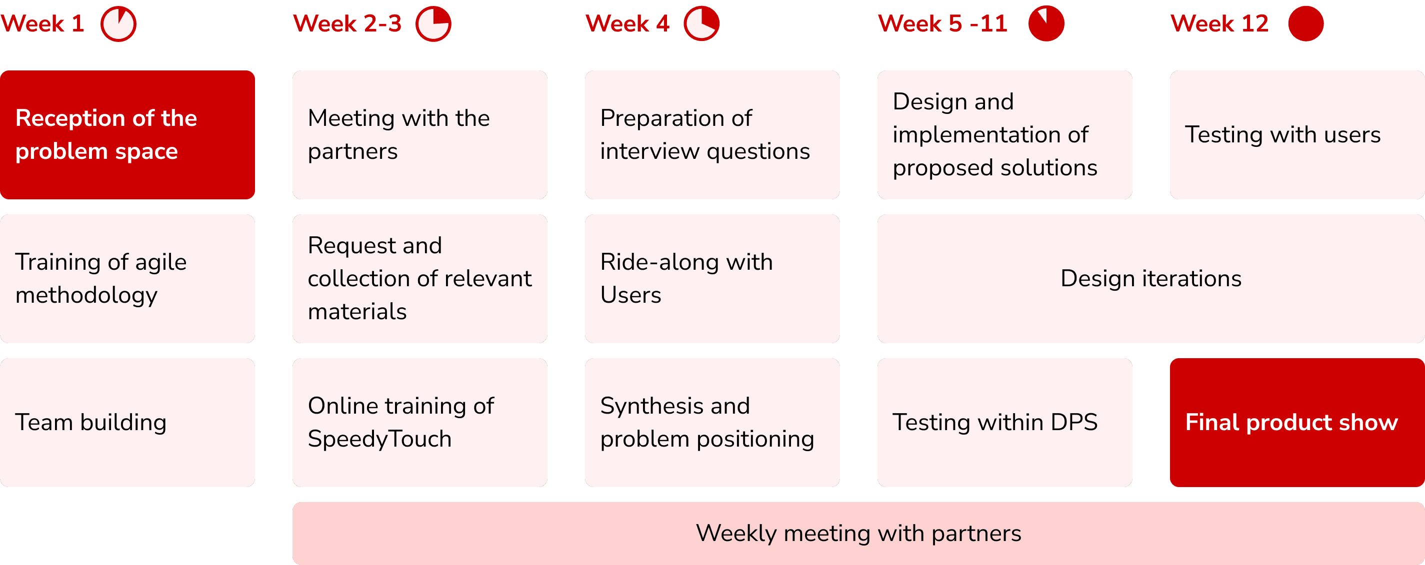
Process Overview
The project starts with a defined problem space. The solutions have been quickly built, tested, and iterated thanks to agile methodology.
Video
User Research
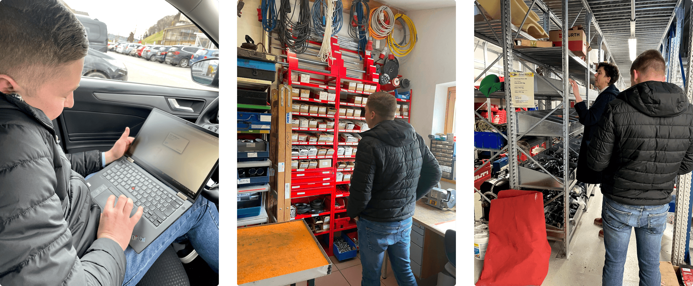
All of our 5 team members participated a ride-along day with a Würth sales representative in Salzburg, Austria to experience a typical day of visiting customers. In total, we participated in 20+ customer visits.
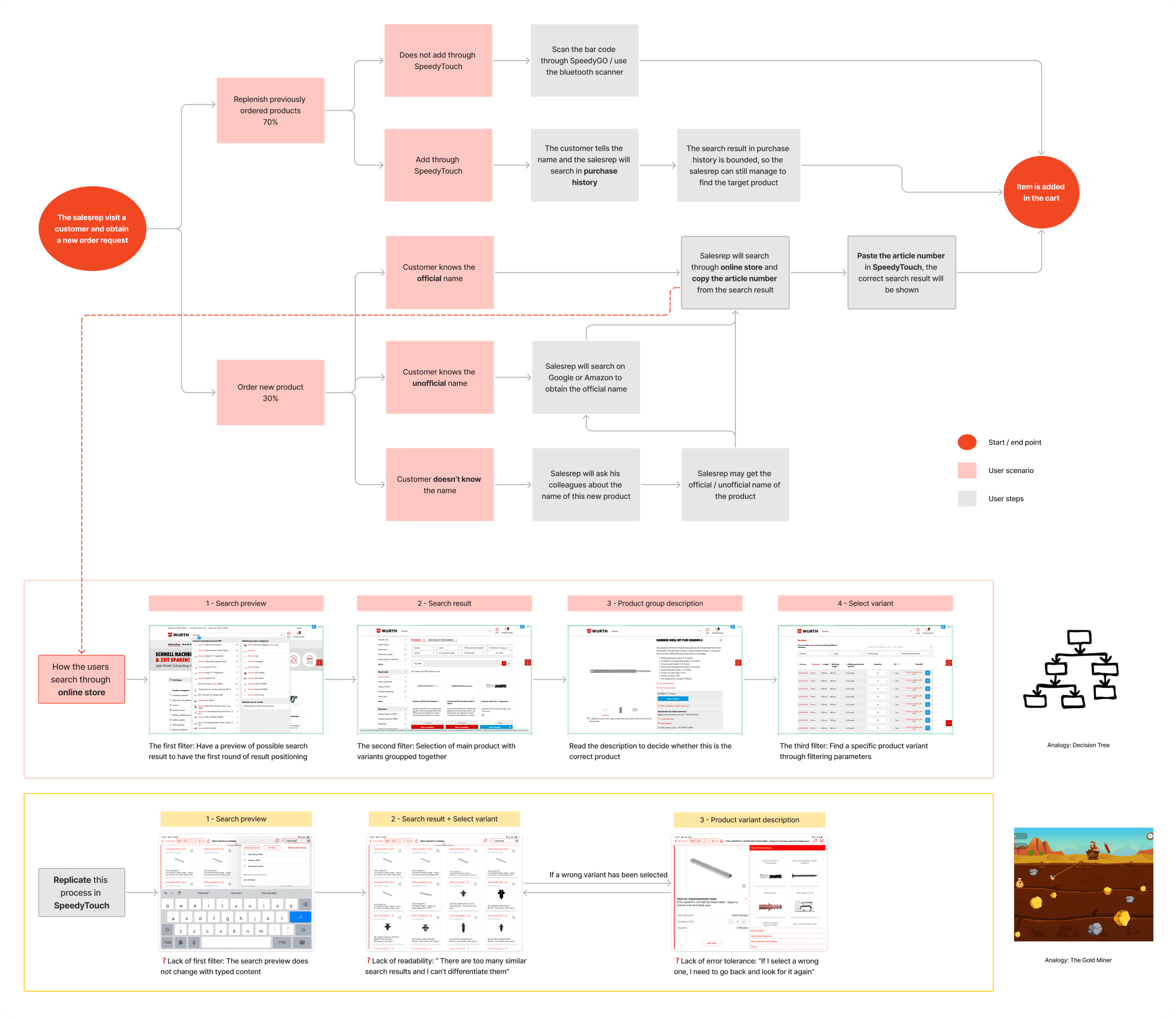
Problems Identified
The search result of SpeedyTouch is unreadable, the user takes a long time to click back and forth to find the right product.
Customers may have their own names to call the same product, so the salesrep need to search online to find the official name.
Sometimes customers don’t know the name of desired product as well, the salesrep needs to ask other colleagues for help but they may not get answered immediately.
Research Observation Analysis
Following the MECE principle (Mutually Exclusive, Collectively Exhaustive), all possible user scenarios and the corresponding user steps have been mapped out.
This approach not only helped the team to understand where and how the problem happened, but also worked as a visual medium to easily align with other roles as well as stakeholders involved.
Design Intervention
To build a robust search experience, we proposed the following design interventions, leading users to find the target product layer by layer:
Layer 1: A dynamic search preview provides users with preliminary reference
Layer 2: A search result page showing products with multiple variants grouped together
Layer 3: A product information page allowing users to find a specific variant through filtering parameters
Finally, the cart page would also be redesigned to accurately reflect the grouped variants
Design Considerations
Maintain familiarity: Respect the Würth Group's visual brand identity and the established layout of SpeedyTouch interfaces to minimise learning curve of existing users.
Selective information display: Cautiously select and display the most relevant information at appropriate moment, to assist the rapidest decision making process.
Design for major use cases: Würth has a huge catelog of 200,000+ different products with varying number of parameters. Design for the majority first and consider extreme cases later.
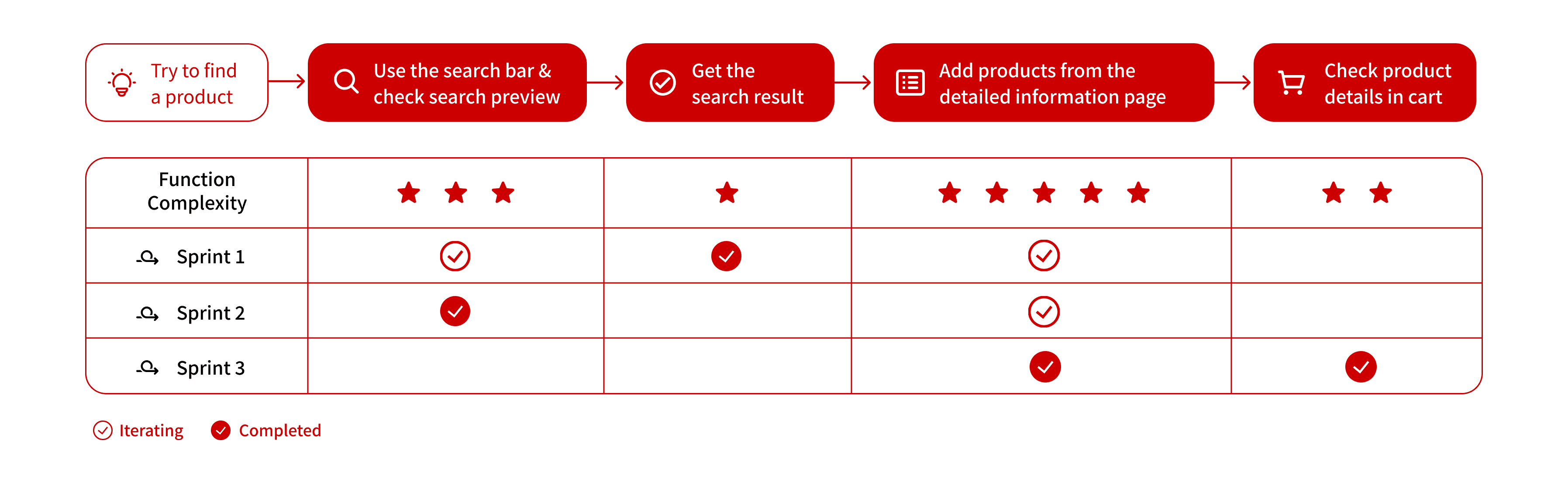
Design Deliveries
Util this point of time, our team has spent all previous days on research and analysis. To start the design&development process and gain momentum in inter-disciplinary collaboration, we intervened from the most essential while simplest function - search result display. Thereafter, other features were expanded on an iterative basis.
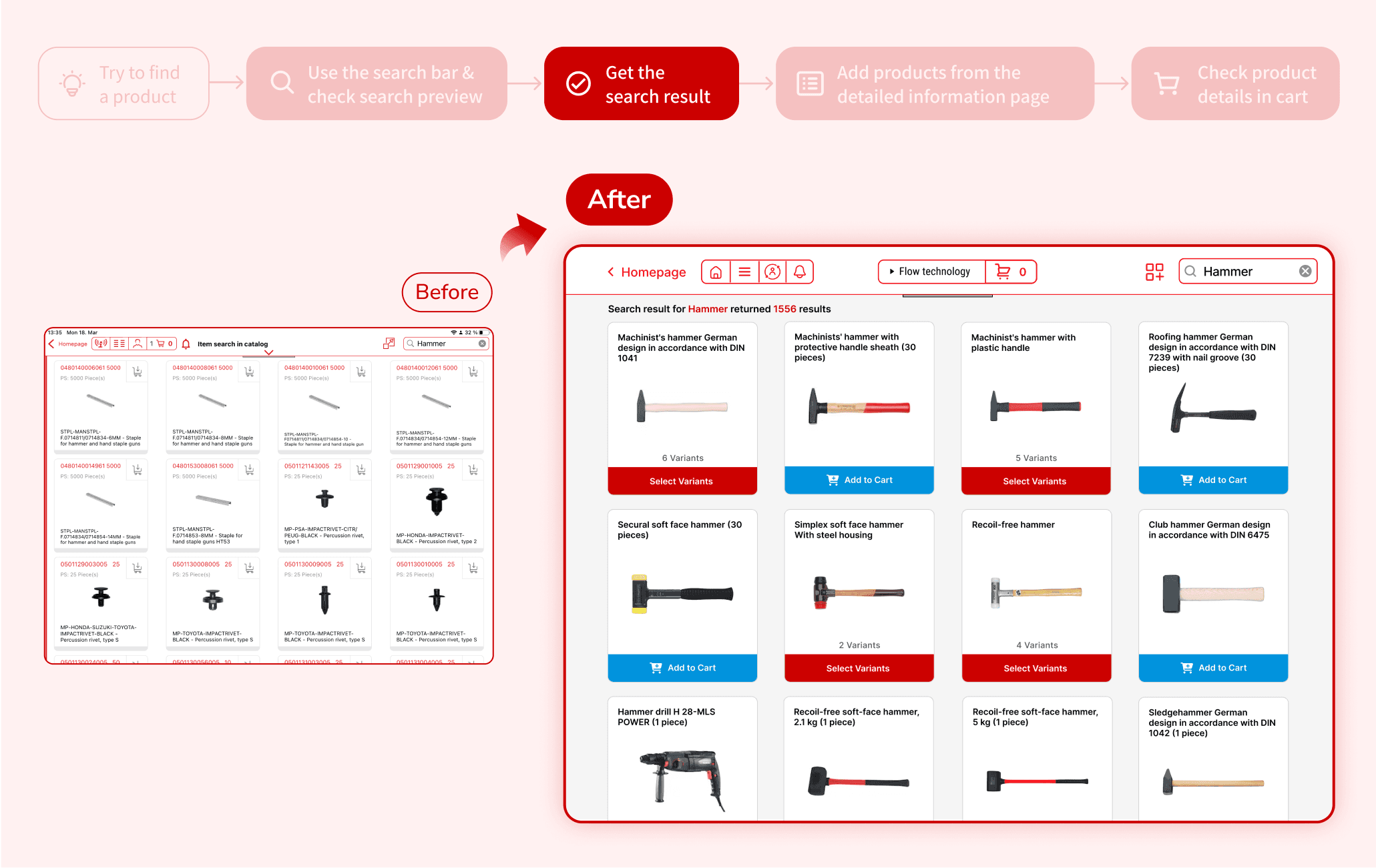
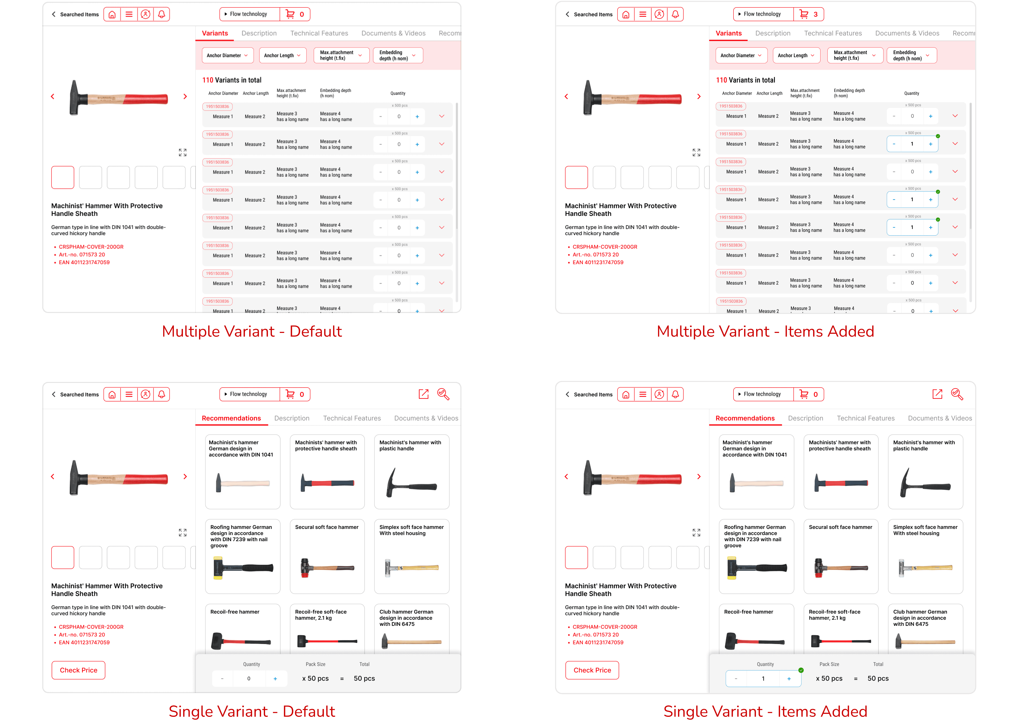
1 - Search Result Display (Sprint 1)
Design Details
UX:
Improved Efficiency & Error Prevention: Products with sub-variants has been grouped together, allowing users to select the main product category first. The error in product selection has been almost eliminated thereby.
UI:
Consistency of Design Language: Combined the design language of both online shop and SpeedyTouch, keeping existing users’ sense of familiarity.
Clear Guidance of Action: Distinctive and large call-to-action buttons, allowing users to operate quickly without digesting extra noise.
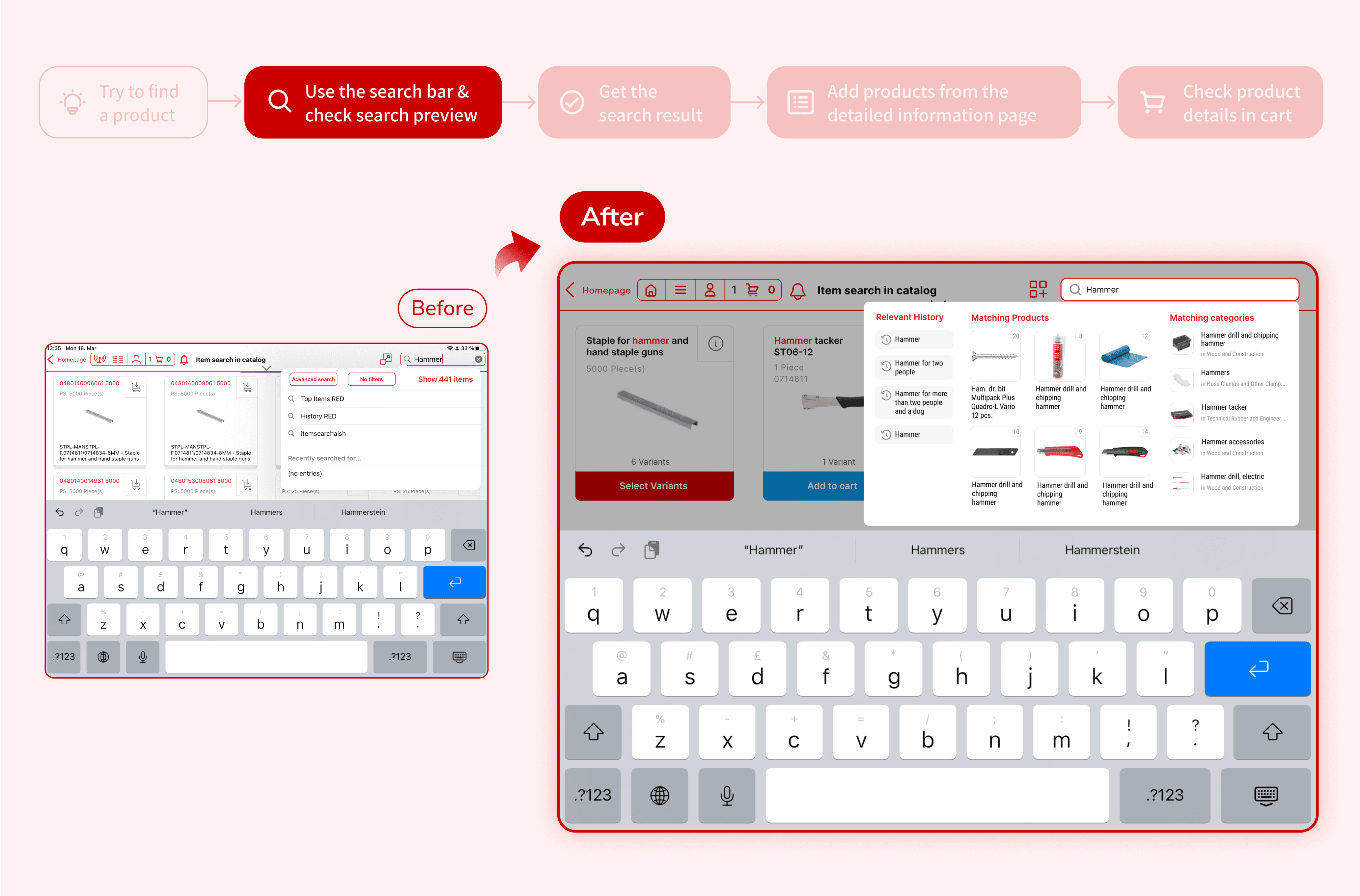
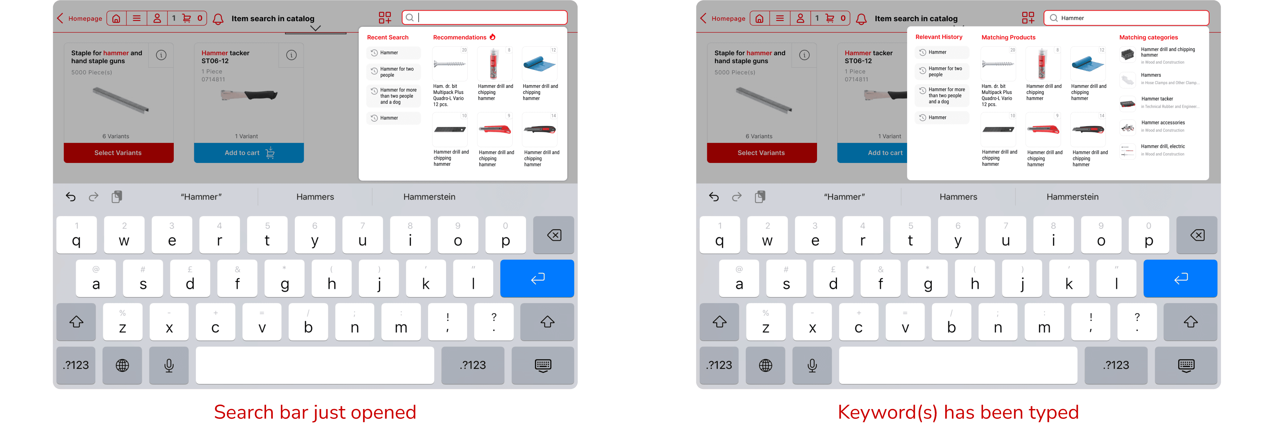
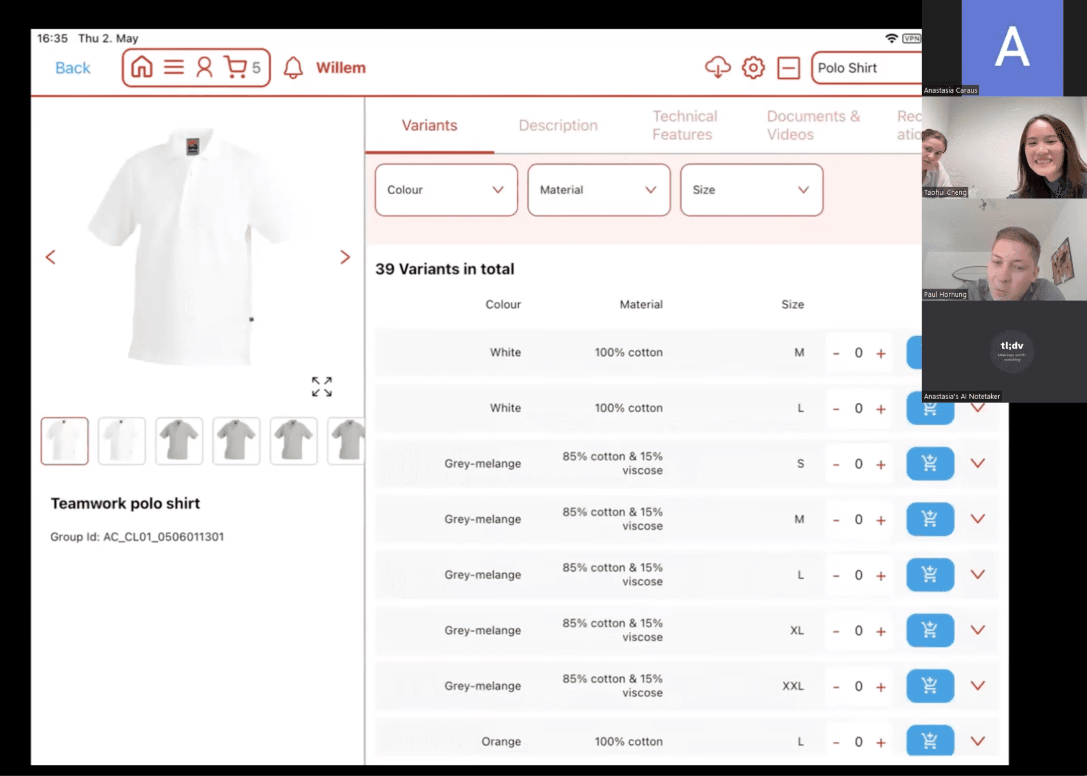
2 - Search Preview (Sprint 2)
Design Details
UX:
Dynamic and Relevant Information Provided
Search preview changes with typed keyword, providing relevant reference to assist decision making.
Search history is always displayed, facilitating the scenario of previously ordered products replenishment.
‘Marching Products’ and ‘Matching Categories’ are both provided, allowing decision making in 2 levels of granularity.
Drive Business Growth: Product recommendations is shown at the start, promoting the sale of advertised items.
UI:
Intentional Information Exposure: ‘Matching Products’ has the largest area and images, guiding users’ attention towards the most accurate results.
Other States
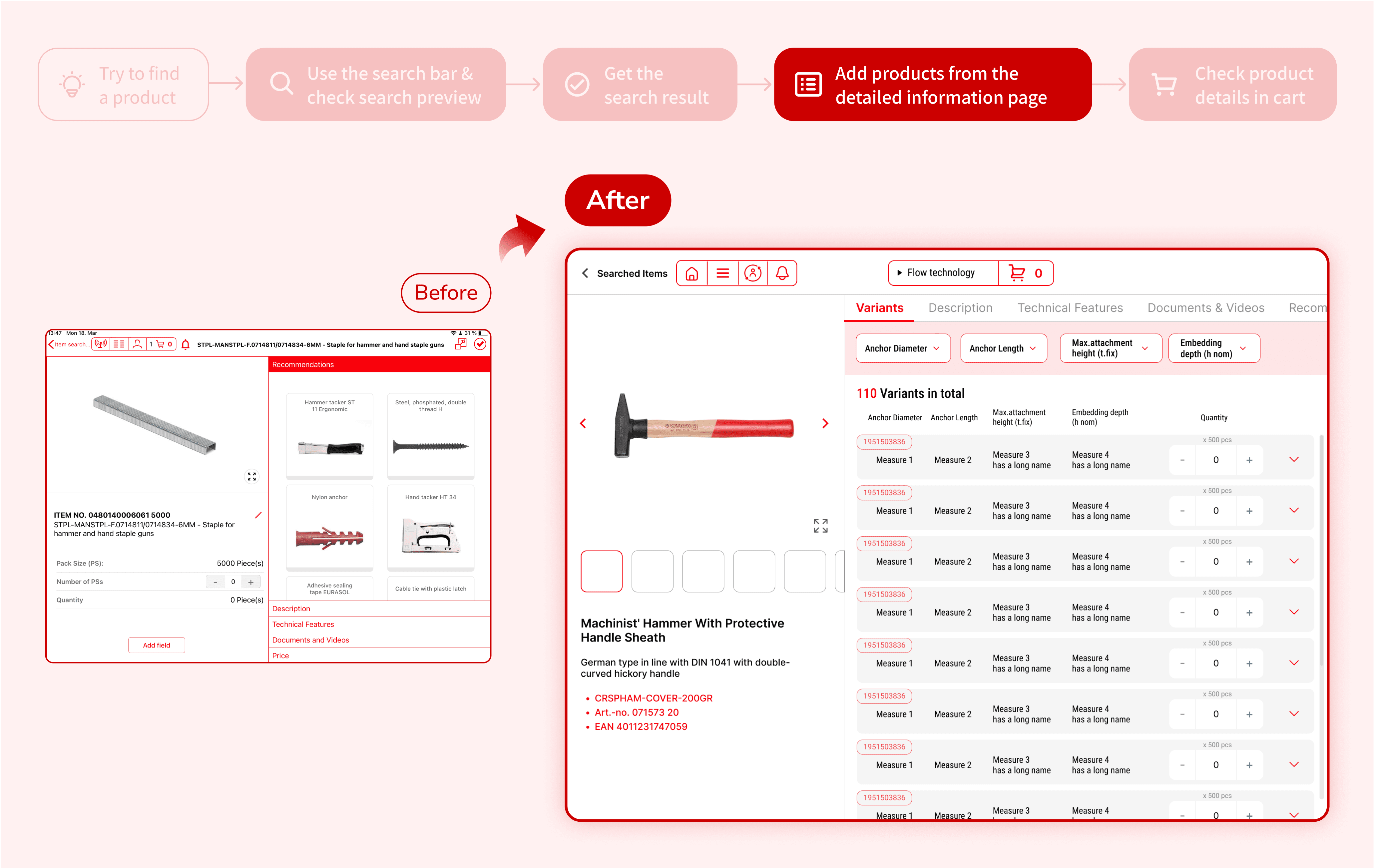
3 - Detailed Information Page (Sprint 3)
Design Details
UX:
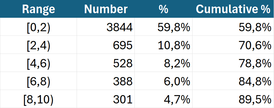
Design for Major Use Cases: for 70% of products in the catalogue, there are no more than 4 differentiating parameters (I captured this trend from observation, and asked the engineers to check from database, as the image displayed). Users also can find the variant they want in almost any product in this setting.
Keep User’s Original Usage Habit: click the ‘add’ button and the product will be added into cart automatically, instead of having a dedicated cart button.
UI:
Clear Semantics of Different Colours: red for highlighting information while blue for 'call to action'.
More Efficient Layout: Horizontal tabs instead of vertical tabs to leave space for the most important user task.
Other States
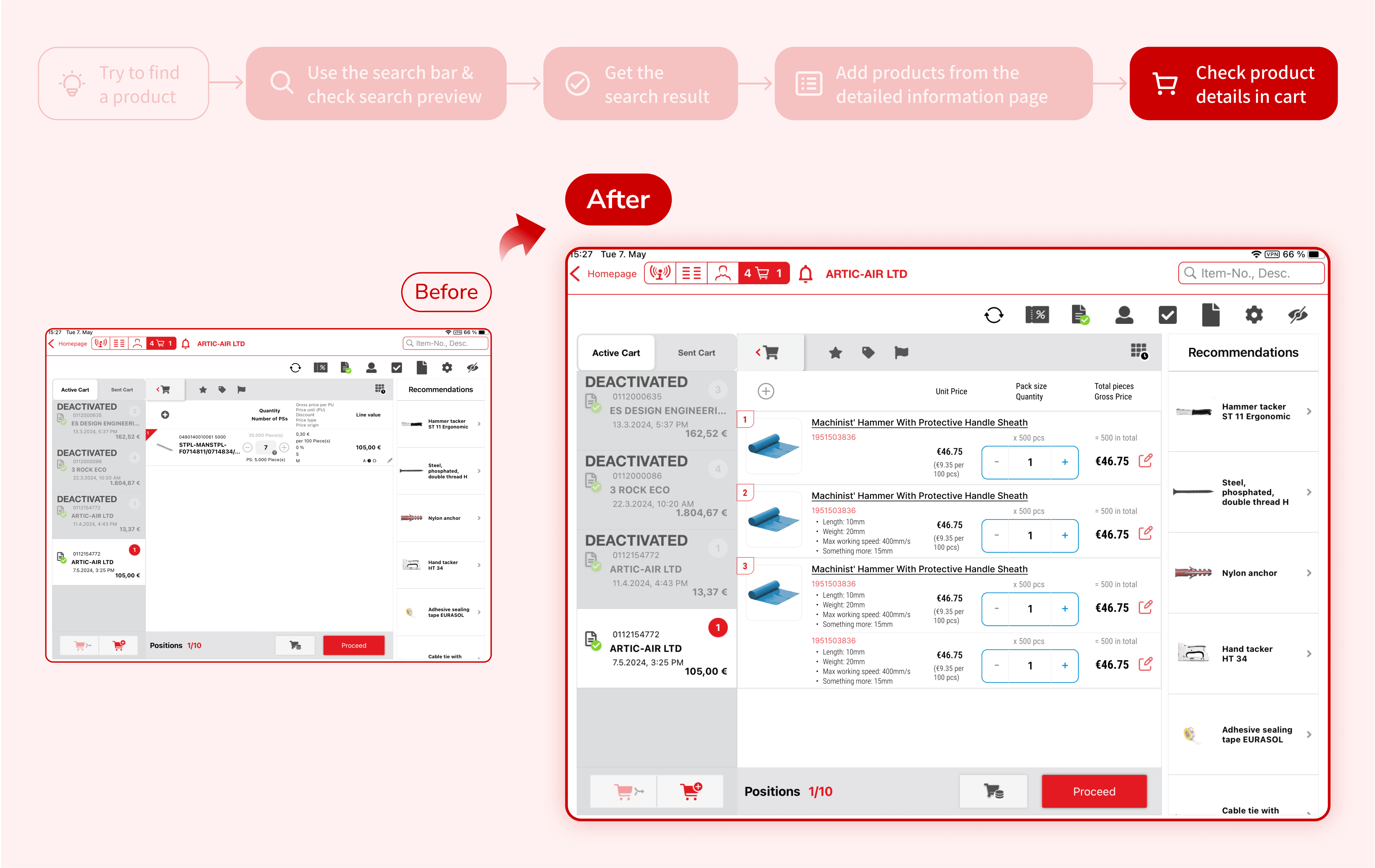
4 - Cart Page (Sprint 3)
Design Details
UX:
Consistency of Design Pattern: In correspondence with grouping product variants, different variants of the same product would be grouped in the cart as well.
UI:
Clearer Content Hierarchy.
Visual Language is Consistent with all previous designed interfaces.
User Testing
Setting:
A working MVP that was developed within 12 weeks
4 individual testing sessions with Austrian sales representatives.
1 group testing session with 12 Irish sales representatives.
Result:
Users’ willingness to use this version of SpeedyTouch is 8.4/10
The new search preview as well as the entire design concept of grouped search result have been well validated
The relevance ranking of search result can be further improved
Impact
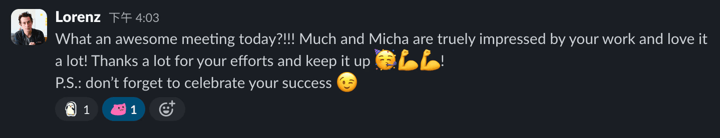
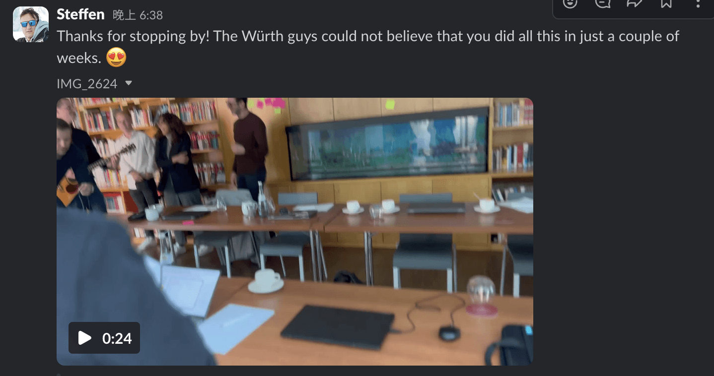
Our project outcome was highly valued by the Würth group, and we were the only team in the entire batch that was invited to pitch our outcome to the executive team ;)
Being inspired by the design thinking process and methodologies that I presented, Würth Phoenix CEO expressed his interest to build a dedicated design team within the department.
Testimonials
Reflections
Problems Encountered & How I Solved
Language Barrier and Device Difference: We were requested to design for Ipad application while stakeholders only provided us with almost non English speaking Austrian users that use Window version, which has a remarkably different interface. In this case, in one hand I collected first hand materials (pictures, audios, videos) as much as I can, in the other hand I would request the user to replicate the journey in my device when I suspected a possible source of pain point.
Interdisciplinary Collaboration and Hybrid Setup: Everyone inside our team has different roles and nationalities (and mother tongue), we encountered a couple of collaboration friction and misunderstanding, but through weekly team retro, regular team building activities, and transparent communication, we became a very cohesive team that truly trust and support each other.
Key Learnings
Fail and Iterate Quickly: Working in agile makes me realise it is impossible to make correct assumption and perfect solution at one time in complex real-life scenarios. An effective approach is to build something tangible quickly first, collect constructive feedback from real users and stakeholders, and iterate to make it better.
User Experience is NOT Just About UX Design: In the case of searching experience, apart from how the search result is visually presented, the product relevance ranking also determines how quick the user can find the target — which is driven by the search algorithm behind. Hence, as a team player, communicating those user testing discoveries to the the engineers is the key to collectively build a robust search experience.
Next Step
Design for Faceted Search: For Würth's massive product catalog, in order to further enhance the search experience, faceted search can be adopted to allow users filter through certain characteristics (colour, material, length etc) in search result page.
Design for Extreme Products: We found that ~70% of products with multiple variants have no more than 4 differentiating parameters in the database, and the current product detail page is designed based on this fact. To provide a more complete solution, I would also provide a design solution for those that have more than 4.
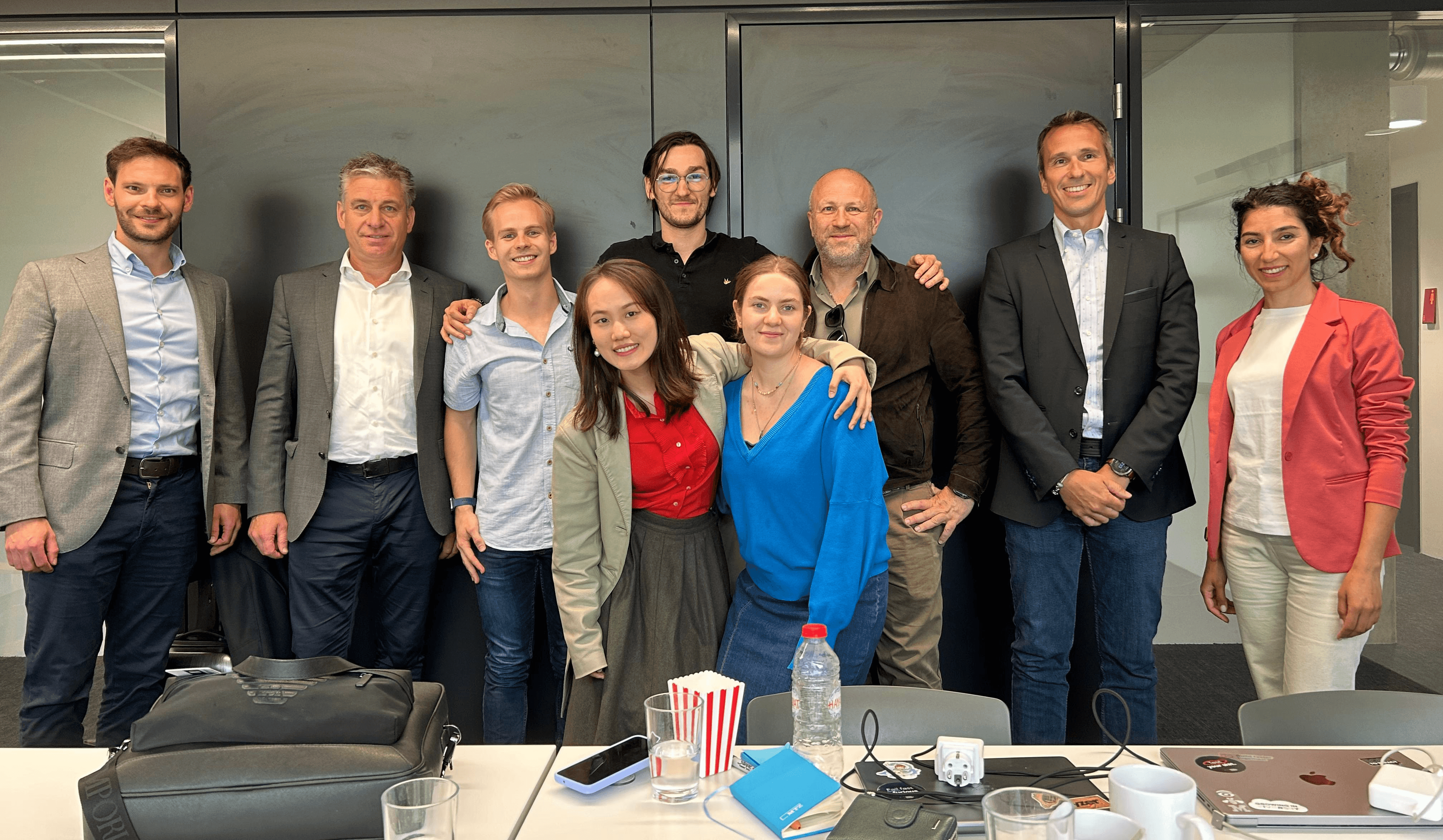
In closing, I’d like to extend my heartfelt gratitude to my teammates, mentors, and Würth partners for making this journey both challenging and incredibly enriching. I’m deeply grateful to you all. ❤️

👷 Summary:
Wurth is a world leading manufacturer and seller of fastening and assembly products. SpeedyTouch is a software (on Tablet PC) used by Würth's sales representatives for customer visits everyday.
However, a distinctive pain point emerged: instead of searching for new products directly within SpeedyTouch, users frequently switched to Würth's online shopping website to fulfill customer requests. This behavior disrupted the flow of customer interactions and created inefficiencies.
To address this challenge, our team conducted an in-depth investigation into user behavior and identified key areas for improvement. We reimagined the user journey by grouping product variants and restructuring the process into 4 connected stages: displaying search previews, retrieving search results, navigating to product detail pages, and adding items to the cart. Through agile, cross-functional collaboration, we delivered a functional MVP within 12 weeks.
The results were highly promising: user testing revealed an 8.6/10 willingness-to-use score for our proposed solution. Additionally, the product garnered strong stakeholder satisfaction, leading to an invitation to present our solution to Würth's Executive Management Team (EMT).
Context
Digital Product School by UnternehmerTUM
Digital Product School is a program within UnternehmerTUM - Europe’s leading centre for innovation and business creation in cooperation with Zentrum Digitalisierung Bayern. DPS connects cross-disciplinary teams with industrial organisations to provide practical solutions in terms of building digital products in a vibrant start-up environment.
(It's NOT a bootcamp, I was selected through application and got paid:)
Würth Group
The Würth Group is the global market leader in the development, production, and sale of fastening and assembly materials. The Würth Group operates worldwide and currently consists of more than 400 companies with more than 2,800 branches and shops in 80 countries.
Process Overview
The project starts with a defined problem space. The solutions have been quickly built, tested, and iterated thanks to agile methodology.
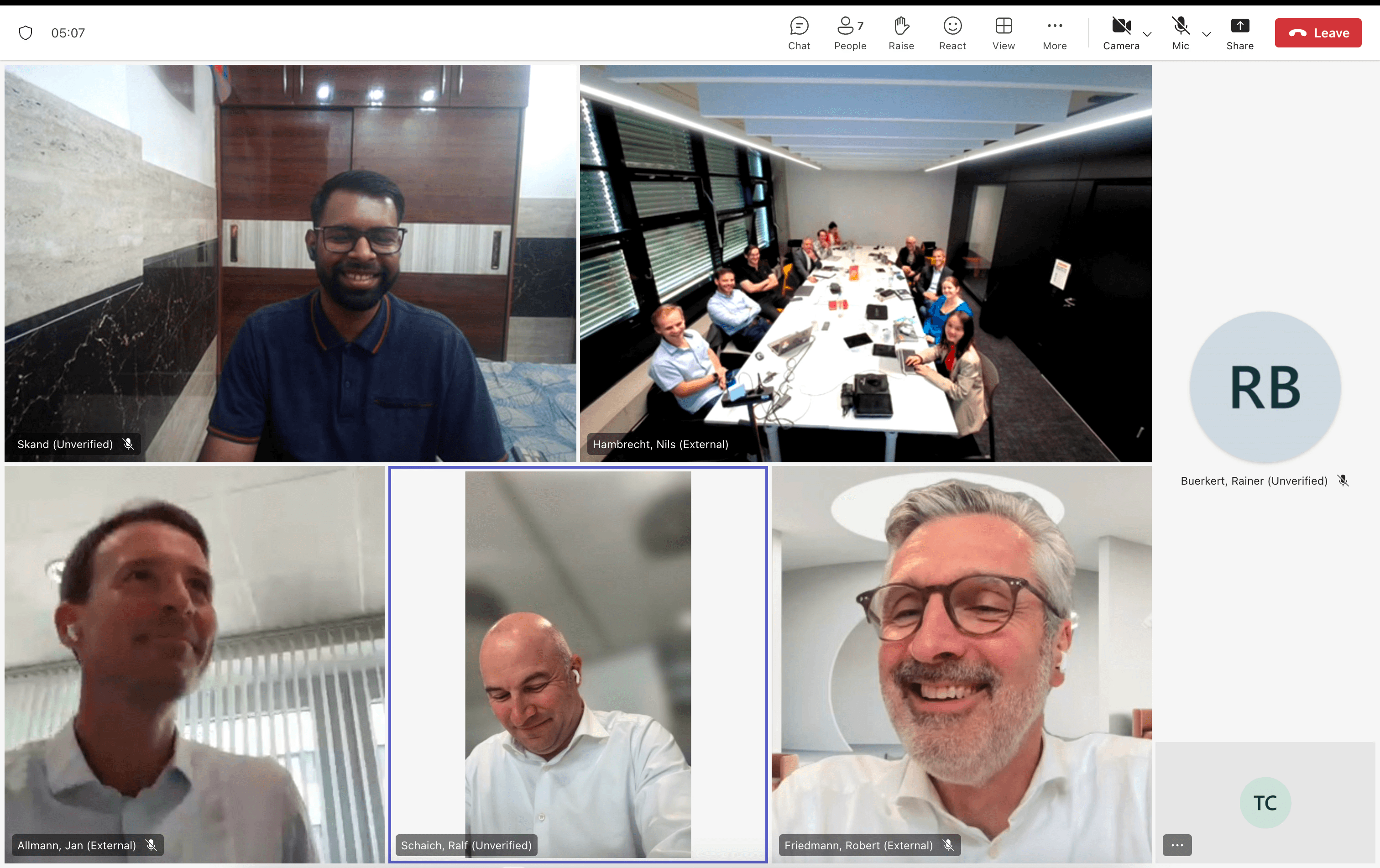
Video
User Research
All of our 5 team members participated a ride-along day with a Würth sales representative in Salzburg, Austria to experience a typical day of visiting customers. In total, we participated in 20+ customer visits.
Problems Identified
The search result of SpeedyTouch is unreadable, the user takes a long time to click back and forth to find the right product.
Customers may have their own names to call the same product, so the salesrep need to search online to find the official name.
Sometimes customers don’t know the name of desired product as well, the salesrep needs to ask other colleagues for help but they may not get answered immediately.
Research Observation Analysis
Following the MECE principle (Mutually Exclusive, Collectively Exhaustive), all possible user scenarios and the corresponding user steps have been mapped out.
This approach not only helped the team to understand where and how the problem happened, but also worked as a visual medium to easily align with other roles as well as stakeholders involved.
Design Intervention
To build a robust search experience, we proposed the following design interventions, leading users to find the target product layer by layer:
Layer 1: A dynamic search preview provides users with preliminary reference
Layer 2: A search result page showing products with multiple variants grouped together
Layer 3: A product information page allowing users to find a specific variant through filtering parameters
Finally, the cart page would also be redesigned to accurately reflect the grouped variants
Design Considerations
Maintain familiarity: Respect the Würth Group's visual brand identity and the established layout of SpeedyTouch interfaces to minimise learning curve of existing users.
Selective information display: Cautiously select and display the most relevant information at appropriate moment, to assist the rapidest decision making process.
Design for major use cases: Würth has a huge catelog of 200,000+ different products with varying number of parameters. Design for the majority first and consider extreme cases later.
Design Deliveries
Util this point of time, our team has spent all previous days on research and analysis. To start the design&development process and gain momentum in inter-disciplinary collaboration, we intervened from the most essential while simplest function - search result display. Thereafter, other features were expanded on an iterative basis.
1 - Search Result Display (Sprint 1)
Design Details
UX:
Improved Efficiency & Error Prevention: Products with sub-variants has been grouped together, allowing users to select the main product category first. The error in product selection has been almost eliminated thereby.
UI:
Consistency of Design Language: Combined the design language of both online shop and SpeedyTouch, keeping existing users’ sense of familiarity.
Clear Guidance of Action: Distinctive and large call-to-action buttons, allowing users to operate quickly without digesting extra noise.
2 - Search Preview (Sprint 2)
Design Details
UX:
Dynamic and Relevant Information Provided
Search preview changes with typed keyword, providing relevant reference to assist decision making.
Search history is always displayed, facilitating the scenario of previously ordered products replenishment.
‘Marching Products’ and ‘Matching Categories’ are both provided, allowing decision making in 2 levels of granularity.
Drive Business Growth: Product recommendations is shown at the start, promoting the sale of advertised items.
UI:
Intentional Information Exposure: ‘Matching Products’ has the largest area and images, guiding users’ attention towards the most accurate results.
Other States
3 - Detailed Information Page (Sprint 3)
Design Details
UX:
Design for Major Use Cases: for 70% of products in the catalogue, there are no more than 4 differentiating parameters (I captured this trend from observation, and asked the engineers to check from database, as the image displayed). Users also can find the variant they want in almost any product in this setting.
Keep User’s Original Usage Habit: click the ‘add’ button and the product will be added into cart automatically, instead of having a dedicated cart button.
UI:
Clear Semantics of Different Colours: red for highlighting information while blue for 'call to action'.
More Efficient Layout: Horizontal tabs instead of vertical tabs to leave space for the most important user task.
Other States
4 - Cart Page (Sprint 3)
Design Details
UX:
Consistency of Design Pattern: In correspondence with grouping product variants, different variants of the same product would be grouped in the cart as well.
UI:
Clearer Content Hierarchy.
Visual Language is Consistent with all previous designed interfaces.
User Testing
Setting:
A working MVP that was developed within 12 weeks
4 individual testing sessions with Austrian sales representatives.
1 group testing session with 12 Irish sales representatives.
Result:
Users’ willingness to use this version of SpeedyTouch is 8.4/10
The new search preview as well as the entire design concept of grouped search result have been well validated
The relevance ranking of search result can be further improved
Impact
Our project outcome was highly valued by the Würth group, and we were the only team in the entire batch that was invited to pitch our outcome to the executive team ;)
Being inspired by the design thinking process and methodologies that I presented, Würth Phoenix CEO expressed his interest to build a dedicated design team within the department.
Testimonials
Reflections
Problems Encountered & How I Solved
Language Barrier and Device Difference: We were requested to design for Ipad application while stakeholders only provided us with almost non English speaking Austrian users that use Window version, which has a remarkably different interface. In this case, in one hand I collected first hand materials (pictures, audios, videos) as much as I can, in the other hand I would request the user to replicate the journey in my device when I suspected a possible source of pain point.
Interdisciplinary Collaboration and Hybrid Setup: Everyone inside our team has different roles and nationalities (and mother tongue), we encountered a couple of collaboration friction and misunderstanding, but through weekly team retro, regular team building activities, and transparent communication, we became a very cohesive team that truly trust and support each other.
Key Learnings
Fail and Iterate Quickly: Working in agile makes me realise it is impossible to make correct assumption and perfect solution at one time in complex real-life scenarios. An effective approach is to build something tangible quickly first, collect constructive feedback from real users and stakeholders, and iterate to make it better.
User Experience is NOT Just About UX Design: In the case of searching experience, apart from how the search result is visually presented, the product relevance ranking also determines how quick the user can find the target — which is driven by the search algorithm behind. Hence, as a team player, communicating those user testing discoveries to the the engineers is the key to collectively build a robust search experience.
Next Step
Design for Faceted Search: For Würth's massive product catalog, in order to further enhance the search experience, faceted search can be adopted to allow users filter through certain characteristics (colour, material, length etc) in search result page.
Design for Extreme Products: We found that ~70% of products with multiple variants have no more than 4 differentiating parameters in the database, and the current product detail page is designed based on this fact. To provide a more complete solution, I would also provide a design solution for those that have more than 4.
In closing, I’d like to extend my heartfelt gratitude to my teammates, mentors, and Würth partners for making this journey both challenging and incredibly enriching. I’m deeply grateful to you all. ❤️
👷 Summary:
Wurth is a world leading manufacturer and seller of fastening and assembly products. SpeedyTouch is a software (on Tablet PC) used by Würth's sales representatives for customer visits everyday.
However, a distinctive pain point emerged: instead of searching for new products directly within SpeedyTouch, users frequently switched to Würth's online shopping website to fulfill customer requests. This behavior disrupted the flow of customer interactions and created inefficiencies.
To address this challenge, our team conducted an in-depth investigation into user behavior and identified key areas for improvement. We reimagined the user journey by grouping product variants and restructuring the process into 4 connected stages: displaying search previews, retrieving search results, navigating to product detail pages, and adding items to the cart. Through agile, cross-functional collaboration, we delivered a functional MVP within 12 weeks.
The results were highly promising: user testing revealed an 8.6/10 willingness-to-use score for our proposed solution. Additionally, the product garnered strong stakeholder satisfaction, leading to an invitation to present our solution to Würth's Executive Management Team (EMT).
Context
Digital Product School by UnternehmerTUM
Digital Product School is a program within UnternehmerTUM - Europe’s leading centre for innovation and business creation in cooperation with Zentrum Digitalisierung Bayern. DPS connects cross-disciplinary teams with industrial organisations to provide practical solutions in terms of building digital products in a vibrant start-up environment.
(It's NOT a bootcamp, I was selected through application and got paid:)
Würth Group
The Würth Group is the global market leader in the development, production, and sale of fastening and assembly materials. The Würth Group operates worldwide and currently consists of more than 400 companies with more than 2,800 branches and shops in 80 countries.
Process Overview
The project starts with a defined problem space. The solutions have been quickly built, tested, and iterated thanks to agile methodology.
Video
User Research
All of our 5 team members participated a ride-along day with a Würth sales representative in Salzburg, Austria to experience a typical day of visiting customers. In total, we participated in 20+ customer visits.
Problems Identified
The search result of SpeedyTouch is unreadable, the user takes a long time to click back and forth to find the right product.
Customers may have their own names to call the same product, so the salesrep need to search online to find the official name.
Sometimes customers don’t know the name of desired product as well, the salesrep needs to ask other colleagues for help but they may not get answered immediately.
Research Observation Analysis
Following the MECE principle (Mutually Exclusive, Collectively Exhaustive), all possible user scenarios and the corresponding user steps have been mapped out.
This approach not only helped the team to understand where and how the problem happened, but also worked as a visual medium to easily align with other roles as well as stakeholders involved.
Design Intervention
To build a robust search experience, we proposed the following design interventions, leading users to find the target product layer by layer:
Layer 1: A dynamic search preview provides users with preliminary reference
Layer 2: A search result page showing products with multiple variants grouped together
Layer 3: A product information page allowing users to find a specific variant through filtering parameters
Finally, the cart page would also be redesigned to accurately reflect the grouped variants
Design Considerations
Maintain familiarity: Respect the Würth Group's visual brand identity and the established layout of SpeedyTouch interfaces to minimise learning curve of existing users.
Selective information display: Cautiously select and display the most relevant information at appropriate moment, to assist the rapidest decision making process.
Design for major use cases: Würth has a huge catelog of 200,000+ different products with varying number of parameters. Design for the majority first and consider extreme cases later.
Design Deliveries
Util this point of time, our team has spent all previous days on research and analysis. To start the design&development process and gain momentum in inter-disciplinary collaboration, we intervened from the most essential while simplest function - search result display. Thereafter, other features were expanded on an iterative basis.
1 - Search Result Display (Sprint 1)
Design Details
UX:
Improved Efficiency & Error Prevention: Products with sub-variants has been grouped together, allowing users to select the main product category first. The error in product selection has been almost eliminated thereby.
UI:
Consistency of Design Language: Combined the design language of both online shop and SpeedyTouch, keeping existing users’ sense of familiarity.
Clear Guidance of Action: Distinctive and large call-to-action buttons, allowing users to operate quickly without digesting extra noise.
2 - Search Preview (Sprint 2)
Design Details
UX:
Dynamic and Relevant Information Provided
Search preview changes with typed keyword, providing relevant reference to assist decision making.
Search history is always displayed, facilitating the scenario of previously ordered products replenishment.
‘Marching Products’ and ‘Matching Categories’ are both provided, allowing decision making in 2 levels of granularity.
Drive Business Growth: Product recommendations is shown at the start, promoting the sale of advertised items.
UI:
Intentional Information Exposure: ‘Matching Products’ has the largest area and images, guiding users’ attention towards the most accurate results.
Other States
3 - Detailed Information Page (Sprint 3)
Design Details
UX:
Design for Major Use Cases: for 70% of products in the catalogue, there are no more than 4 differentiating parameters (I captured this trend from observation, and asked the engineers to check from database, as the image displayed). Users also can find the variant they want in almost any product in this setting.
Keep User’s Original Usage Habit: click the ‘add’ button and the product will be added into cart automatically, instead of having a dedicated cart button.
UI:
Clear Semantics of Different Colours: red for highlighting information while blue for 'call to action'.
More Efficient Layout: Horizontal tabs instead of vertical tabs to leave space for the most important user task.
Other States
4 - Cart Page (Sprint 3)
Design Details
UX:
Consistency of Design Pattern: In correspondence with grouping product variants, different variants of the same product would be grouped in the cart as well.
UI:
Clearer Content Hierarchy.
Visual Language is Consistent with all previous designed interfaces.
User Testing
Setting:
A working MVP that was developed within 12 weeks
4 individual testing sessions with Austrian sales representatives.
1 group testing session with 12 Irish sales representatives.
Result:
Users’ willingness to use this version of SpeedyTouch is 8.4/10
The new search preview as well as the entire design concept of grouped search result have been well validated
The relevance ranking of search result can be further improved
Impact
Our project outcome was highly valued by the Würth group, and we were the only team in the entire batch that was invited to pitch our outcome to the executive team ;)
Being inspired by the design thinking process and methodologies that I presented, Würth Phoenix CEO expressed his interest to build a dedicated design team within the department.
Testimonials
Reflections
Problems Encountered & How I Solved
Language Barrier and Device Difference: We were requested to design for Ipad application while stakeholders only provided us with almost non English speaking Austrian users that use Window version, which has a remarkably different interface. In this case, in one hand I collected first hand materials (pictures, audios, videos) as much as I can, in the other hand I would request the user to replicate the journey in my device when I suspected a possible source of pain point.
Interdisciplinary Collaboration and Hybrid Setup: Everyone inside our team has different roles and nationalities (and mother tongue), we encountered a couple of collaboration friction and misunderstanding, but through weekly team retro, regular team building activities, and transparent communication, we became a very cohesive team that truly trust and support each other.
Key Learnings
Fail and Iterate Quickly: Working in agile makes me realise it is impossible to make correct assumption and perfect solution at one time in complex real-life scenarios. An effective approach is to build something tangible quickly first, collect constructive feedback from real users and stakeholders, and iterate to make it better.
User Experience is NOT Just About UX Design: In the case of searching experience, apart from how the search result is visually presented, the product relevance ranking also determines how quick the user can find the target — which is driven by the search algorithm behind. Hence, as a team player, communicating those user testing discoveries to the the engineers is the key to collectively build a robust search experience.
Next Step
Design for Faceted Search: For Würth's massive product catalog, in order to further enhance the search experience, faceted search can be adopted to allow users filter through certain characteristics (colour, material, length etc) in search result page.
Design for Extreme Products: We found that ~70% of products with multiple variants have no more than 4 differentiating parameters in the database, and the current product detail page is designed based on this fact. To provide a more complete solution, I would also provide a design solution for those that have more than 4.
In closing, I’d like to extend my heartfelt gratitude to my teammates, mentors, and Würth partners for making this journey both challenging and incredibly enriching. I’m deeply grateful to you all. ❤️