👵 Summary:
The aging population in European countries has led to a surge in elderly patients in hospitals. Currently, the map and signage system in hospitals is confusing for them, resulting in insecure experience and increased workload for hospital staff and volunteers.
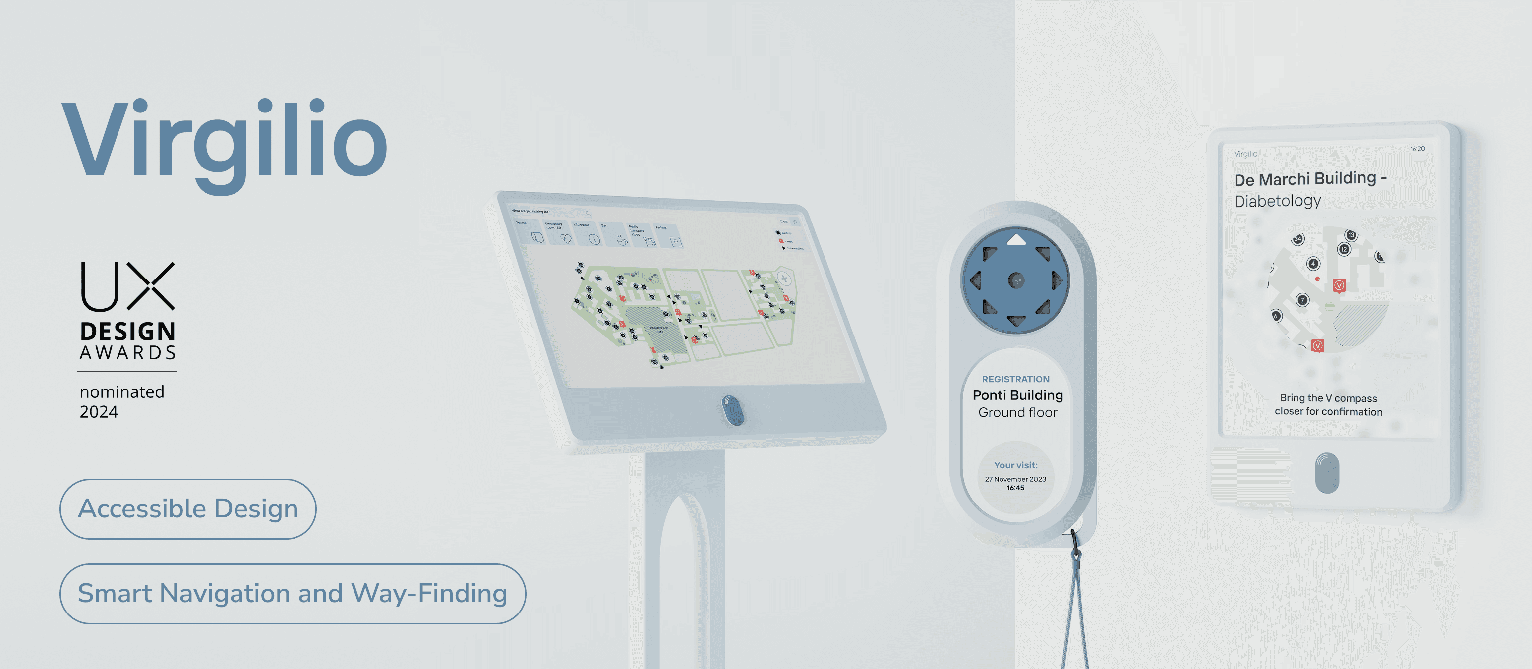
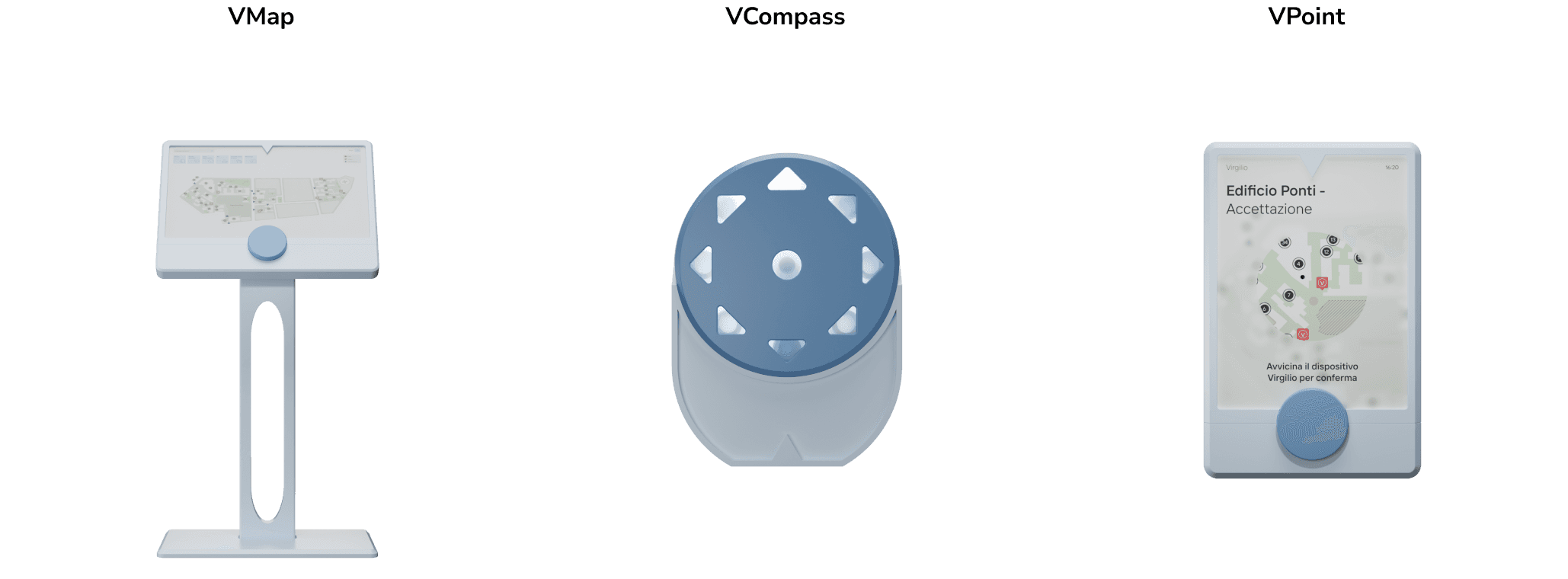
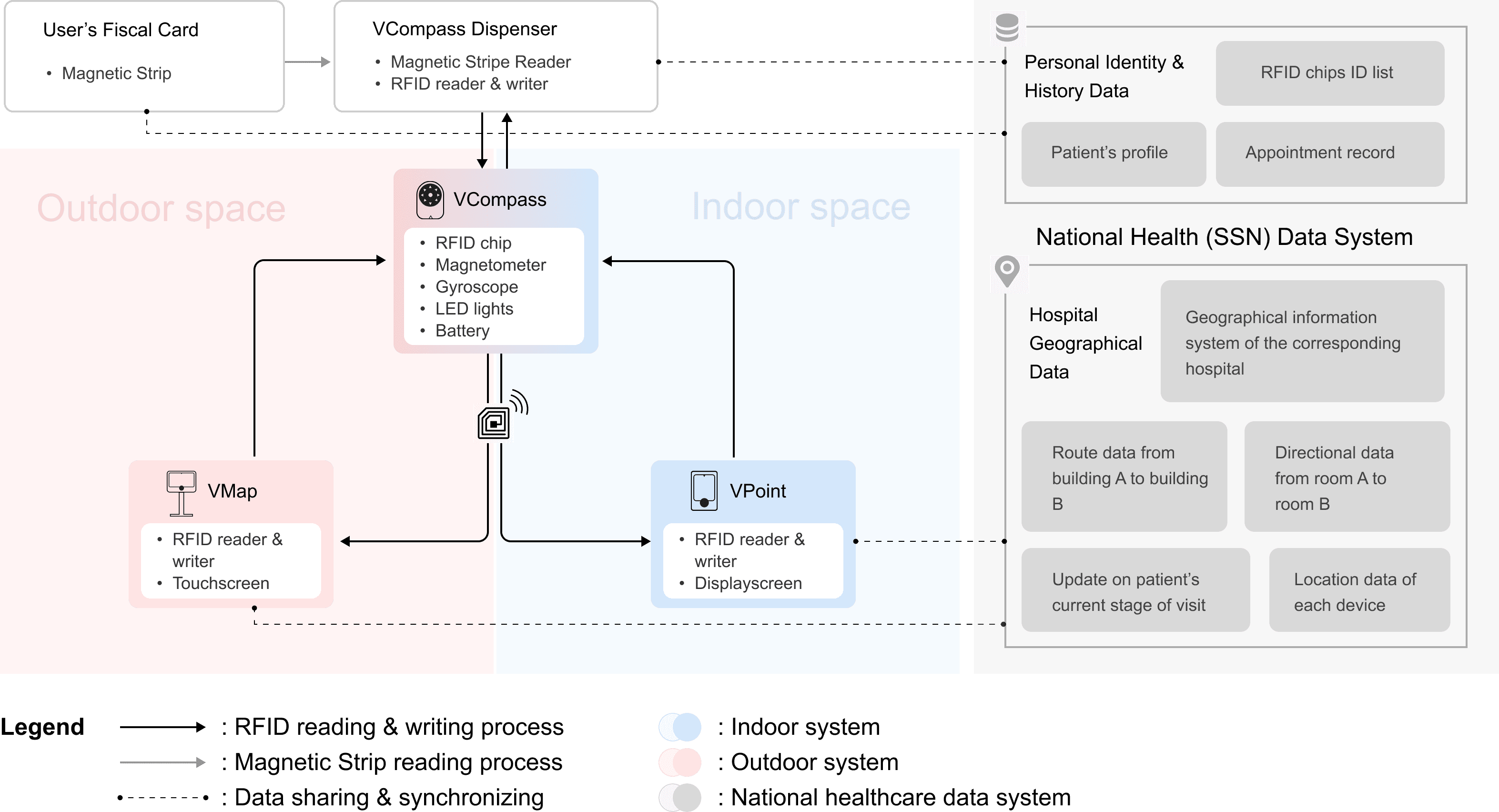
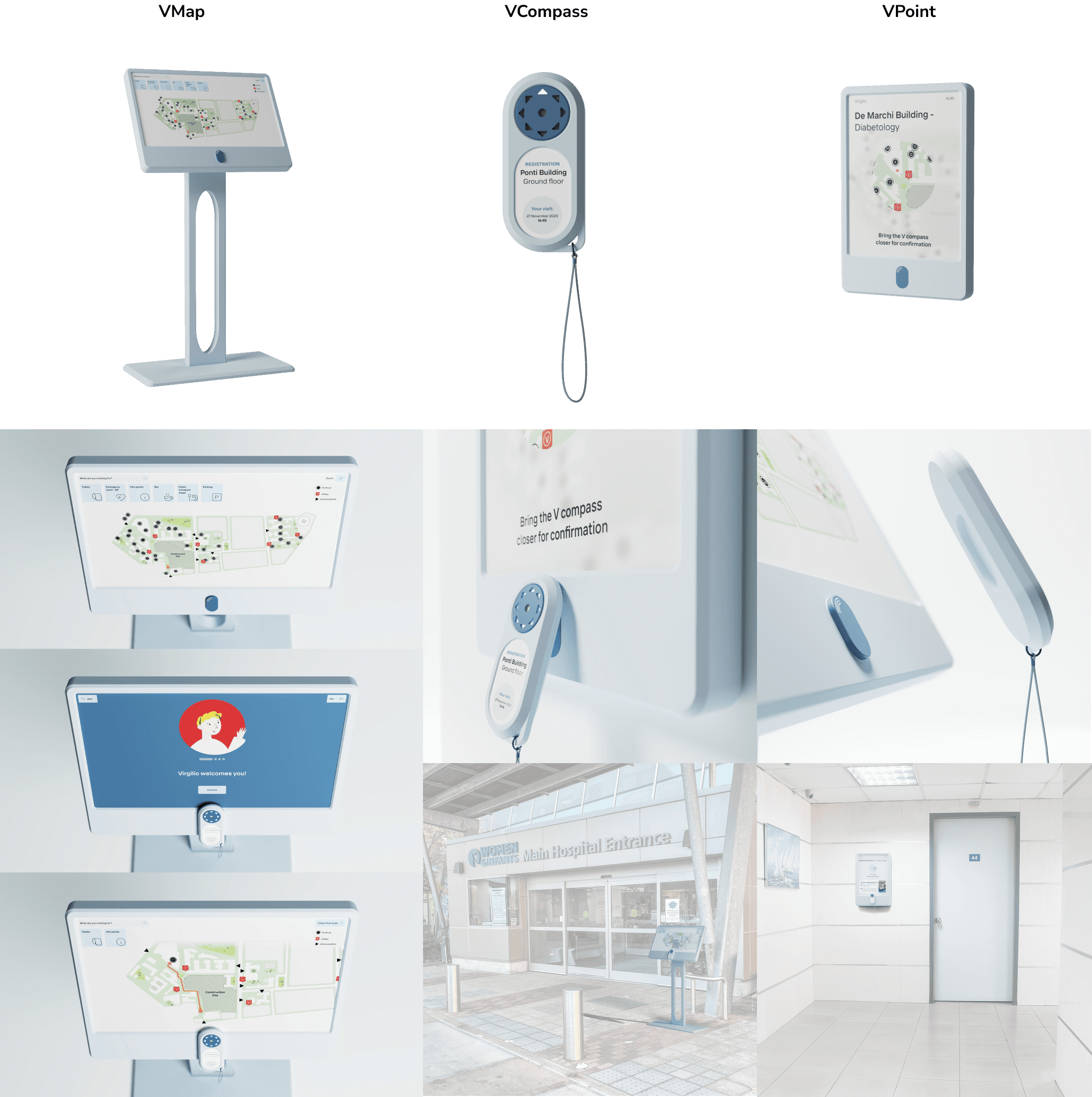
Virgilio, an accessible digital way-finding system, tackles this problem by offering a VCompass with an RFID chip linked to personal medical data. Users can visualize routes on VMaps outdoors and confirm directions indoors by tapping on VPoints. This streamlined and personalised navigation experience alleviates anxiety for elderly patients and ensures timely information and feedback, reducing the burden on hospital staff and providing a sense of security.
This project has been nominated in UX Design Awards 2024 and shortlisted (300 out of 7070) in IF Student Design Award 2024.
P.S: If you wish to try the prototype from the button at the left, please switch the scale into 'Fit Screen'.
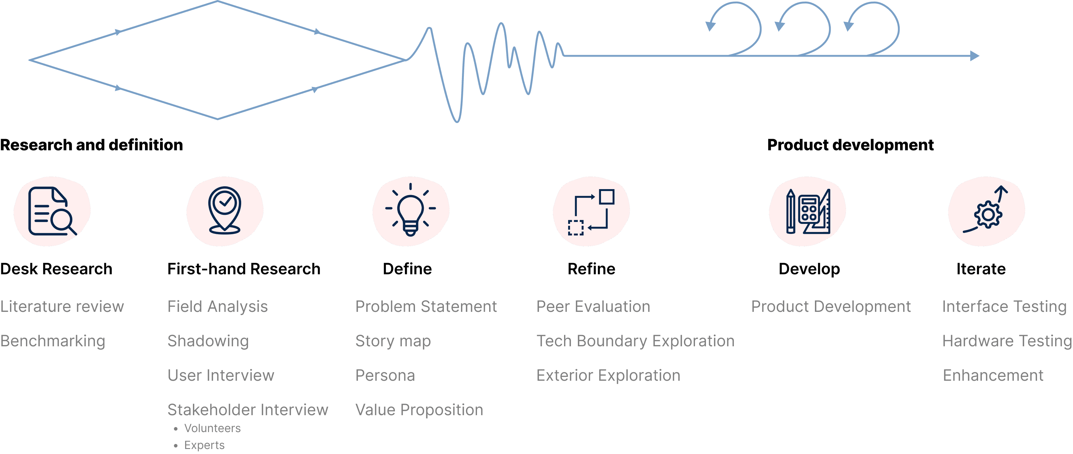
Process Overview
Video
The Problem is…
Aging population is a real trend in European Union. By 2060 the EU is projected to decrease from having 4 working-age people for every person aged over 65 to about 2. It is expected to have more and more elderly patients visiting hospitals alone, while the current way-finding system in hospitals is not always user-friendly for them.
We took Polyclinic of Milan as a typical reference and conducted a comprehensive site investigation.
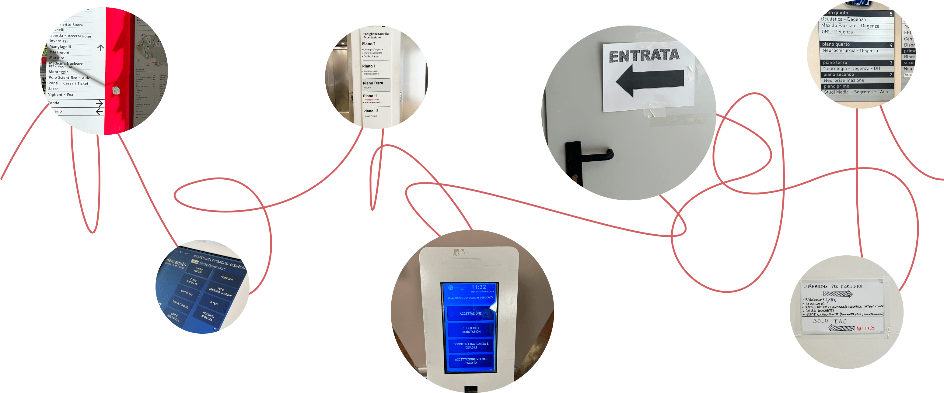
We discovered that in the current way-finding system, the displayed information is not always understandable, and different touch points are not connected, leading to the elderly patients to...
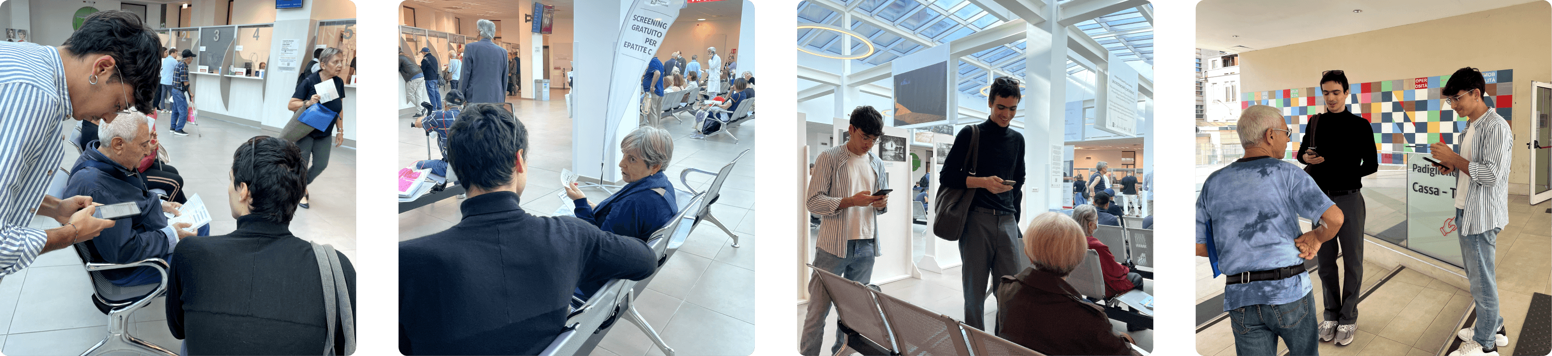
User Research
To understand the pains experienced by both the patients and hospital staff in detail, we conducted 7 in-depth interviews and 4 shadowing sessions.
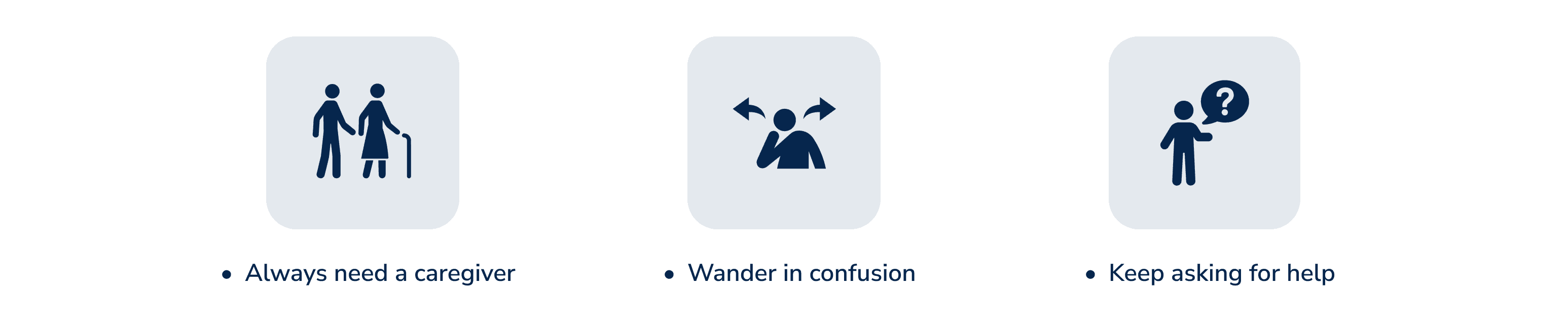
Discovery
As a result, we synthesised our first-hand research findings into 4 key discoveries:
The current signage system is not friendly for the elderly patients, leading to the necessity of asking hospital staff.
The digital devices in the hospital are not user-friendly enough for the elderly patients, leading to distrust and reliance on asking.
Patients are also not about to get 100% correct answers through asking, a lot of extra time and efforts are spent in 'trial and error'.
Patients can still complete the process successfully, while the process might be troublesome and frustrating.
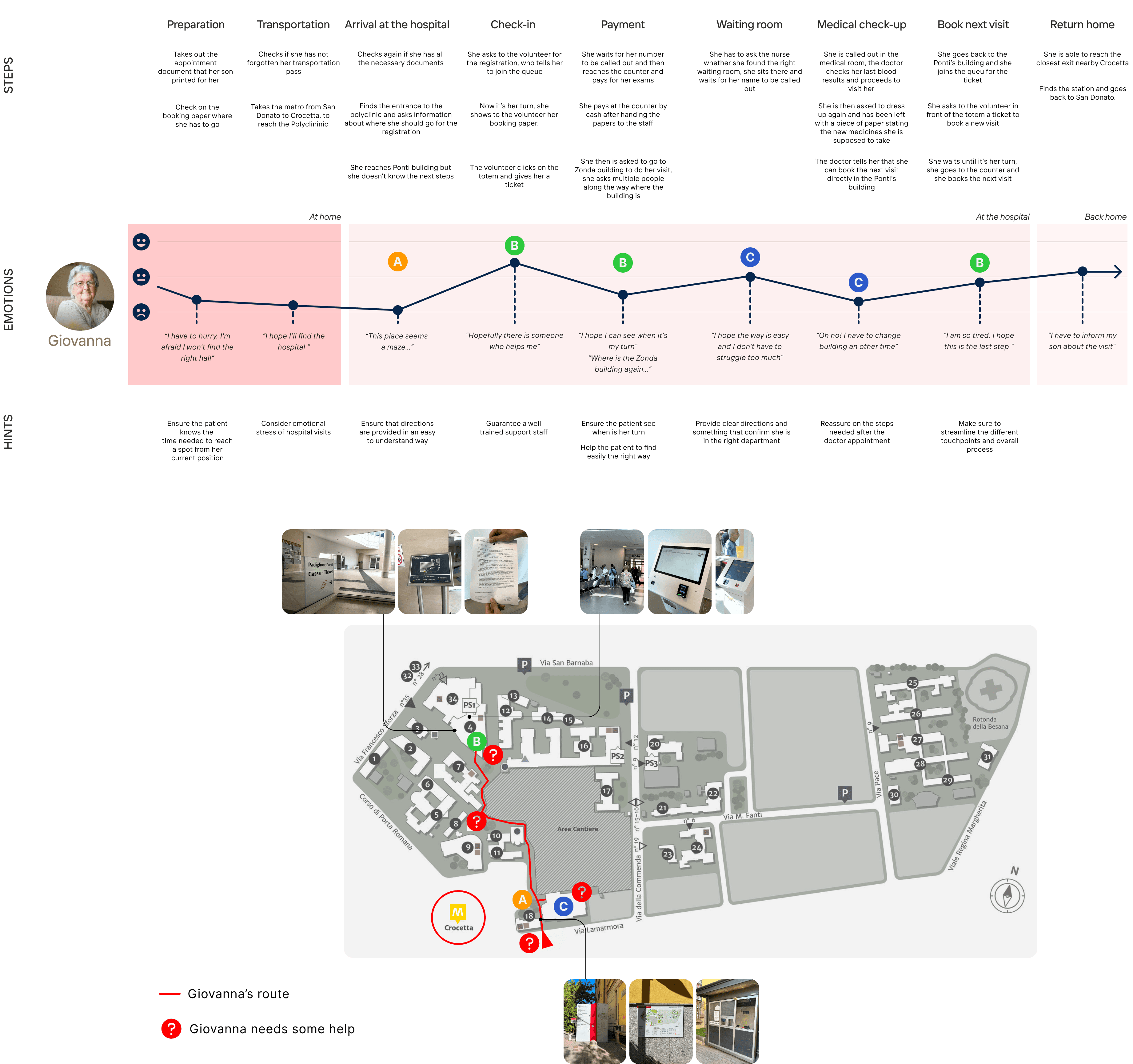
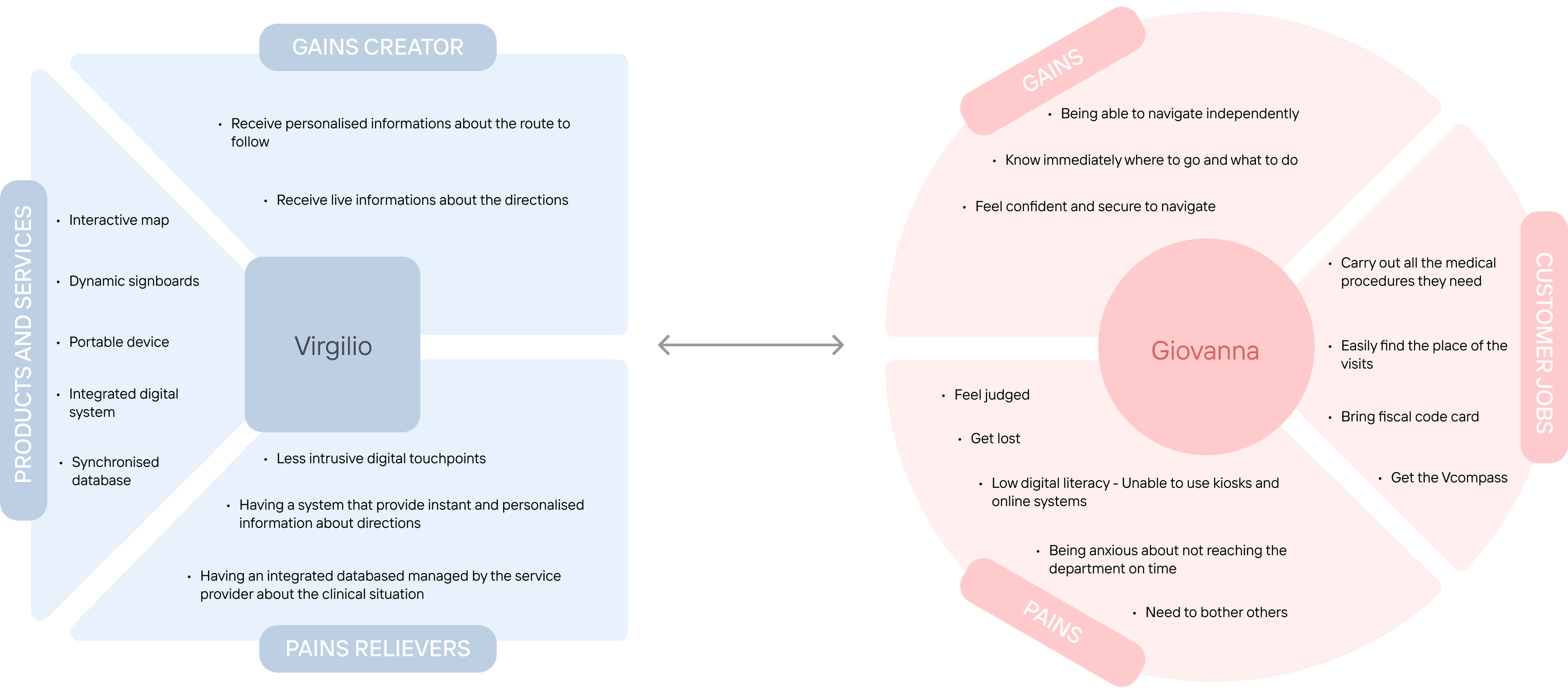
Persona
We synthesised our research discoveries into a typical user - Giovanna, who is a 79-year-old lady who needs to visit hospital frequently due to diabetes. Her route of hospital visit is also extracted to clearly visualise when and where may she need help in Polyclinic of Milan.
Design Concept
Through research, we identified the main user emotion during this hospital visit journey as ‘frustration’, and we aim to reframe it to ‘trust’.
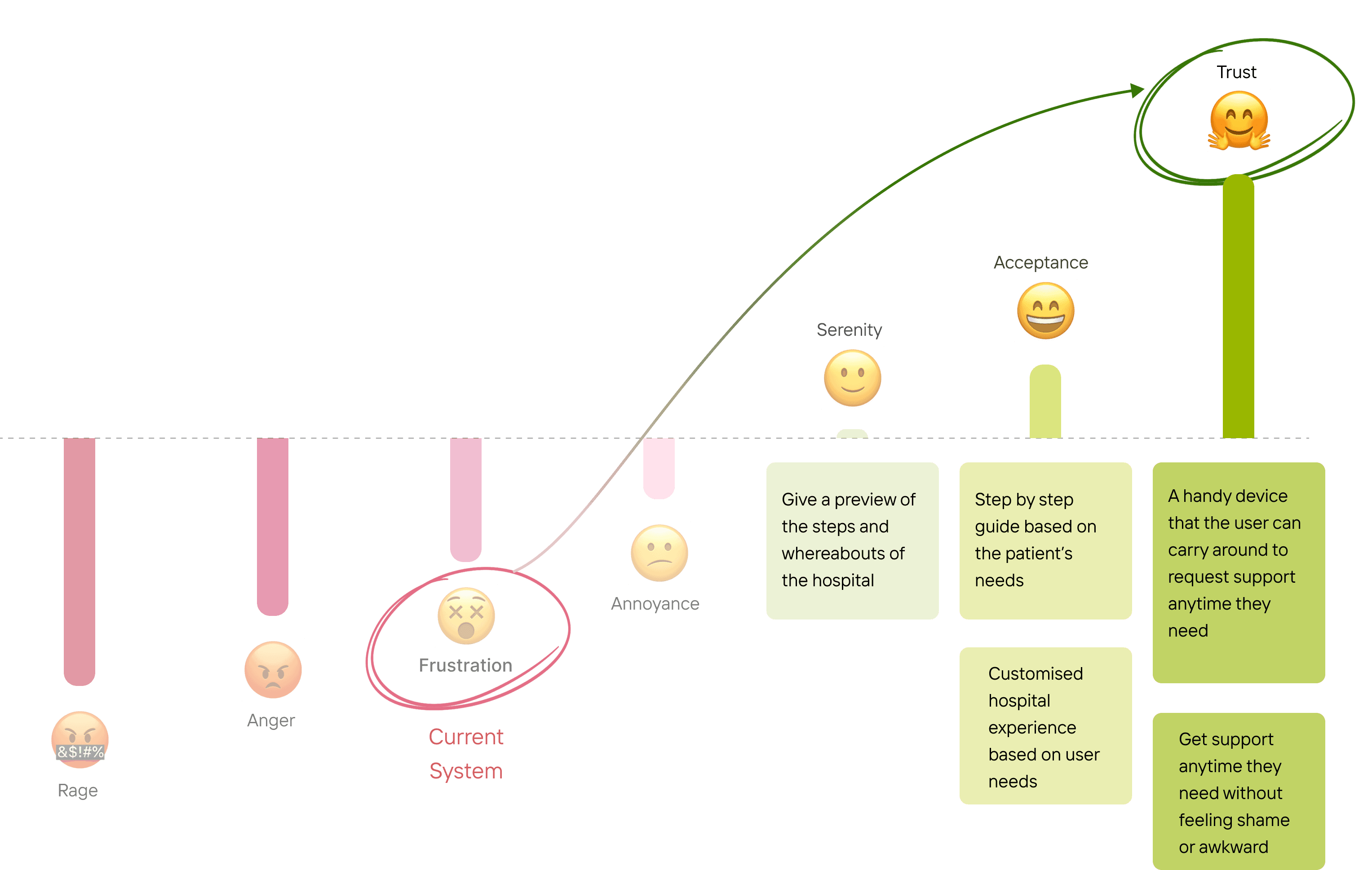
We envisioned an accessible, informative, and streamlined solution.
Design Iterations
Overview
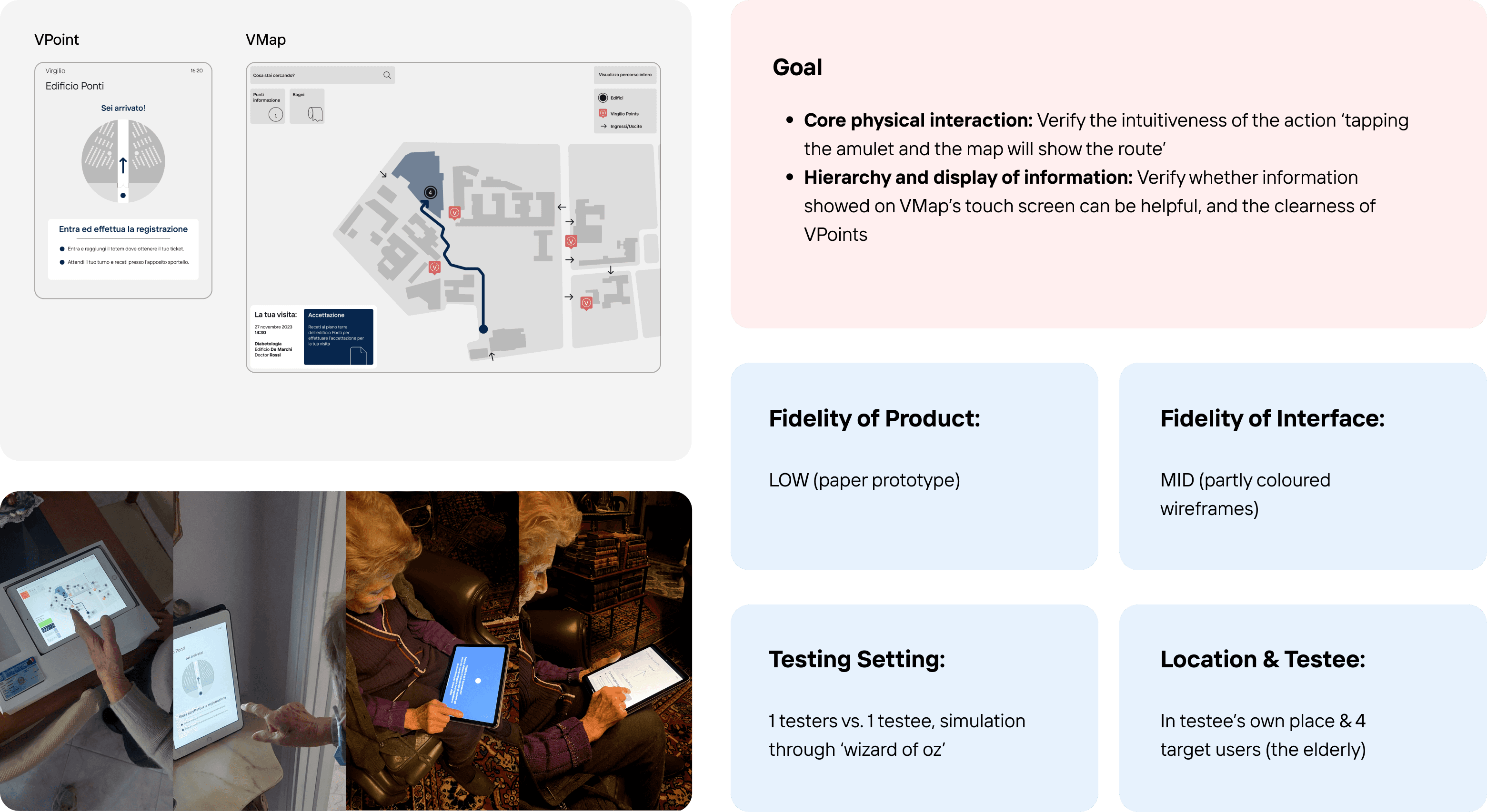
To enable these design considerations as well as taking the technical feasibility into account, we quickly prototyped, tested, and iterated our design proposals for 3 main rounds, with increased balance of user experience and technical possibility.
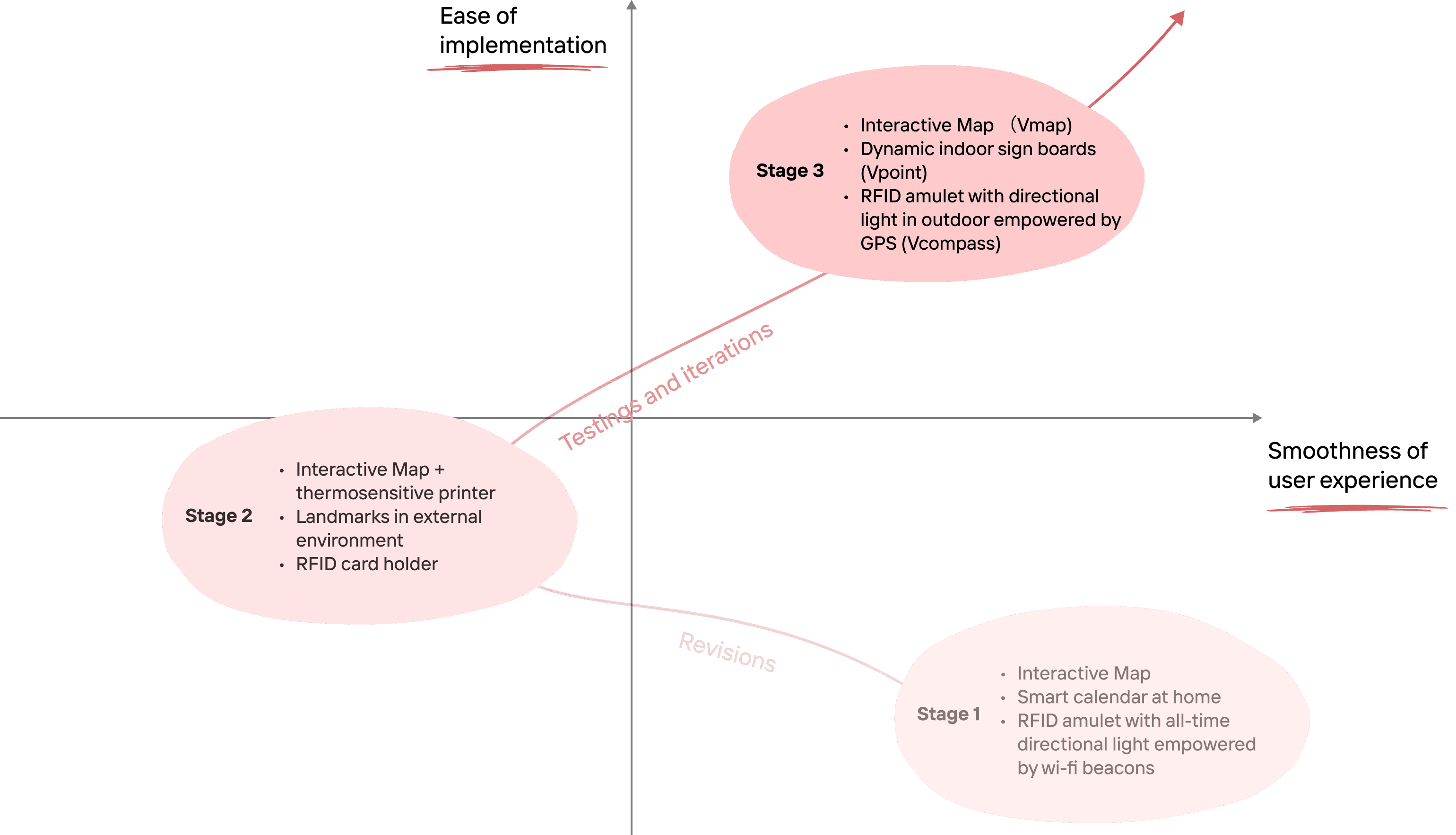
Iteration 1
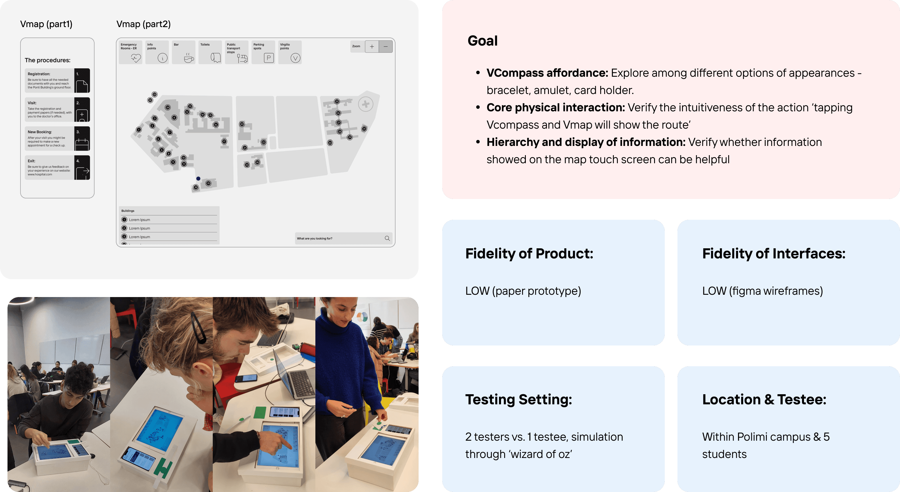
Iteration 2
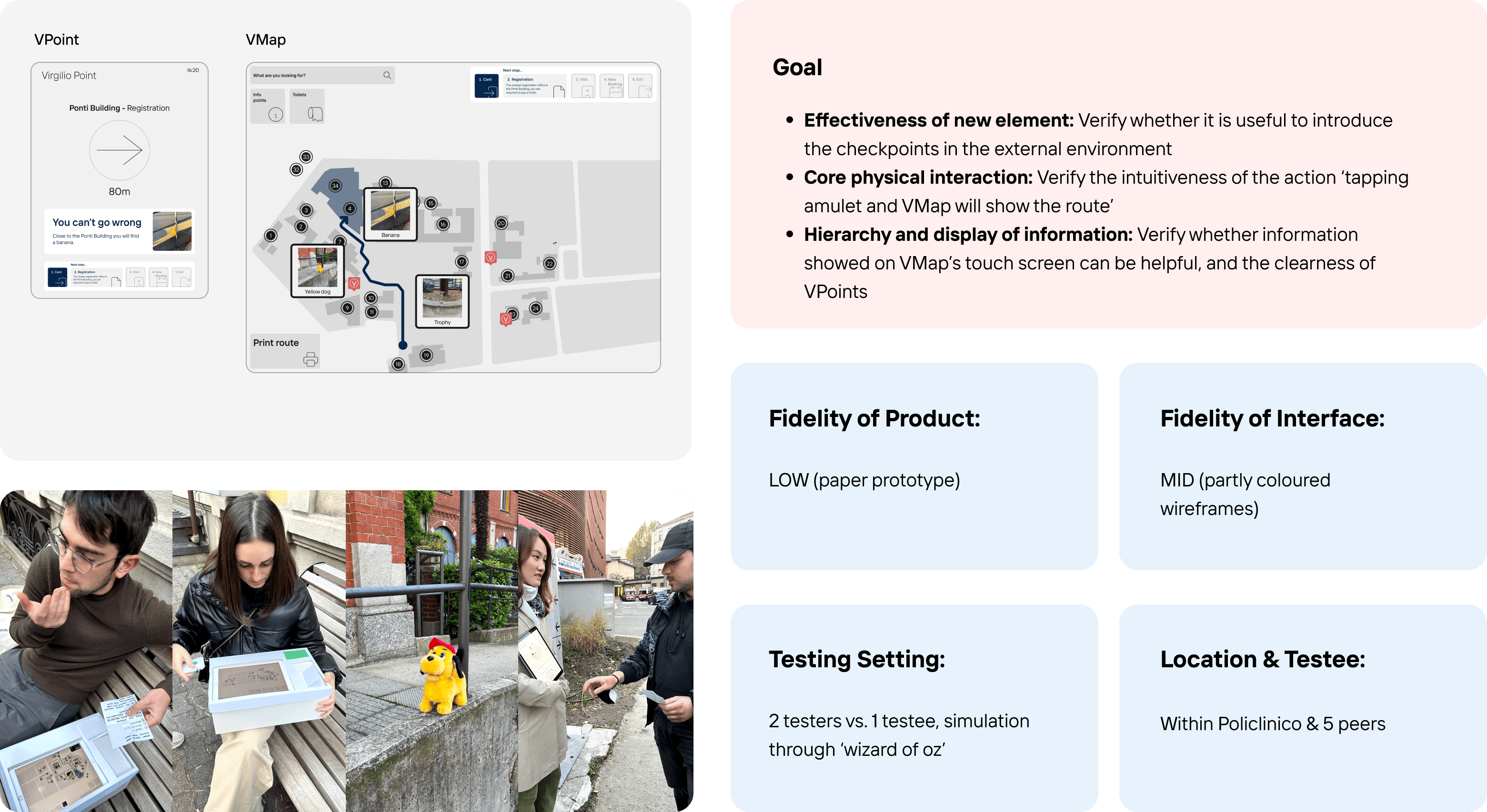
Iteration 3
Design Version 1
Within a designated time frame, we synthesised our design into a version that has a satisfactory balance between user-friendliness, field feasibility, and technical complexity.
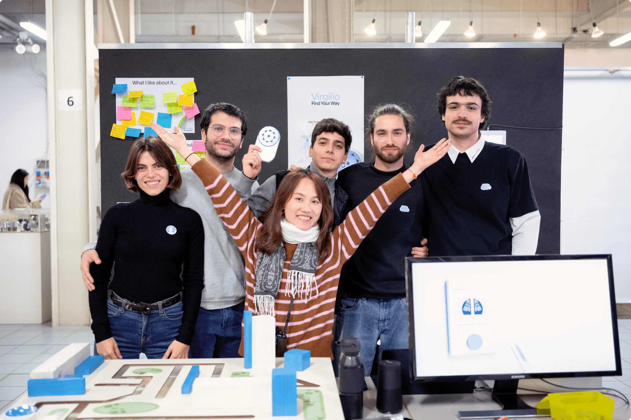
MVP Showcase and Testing
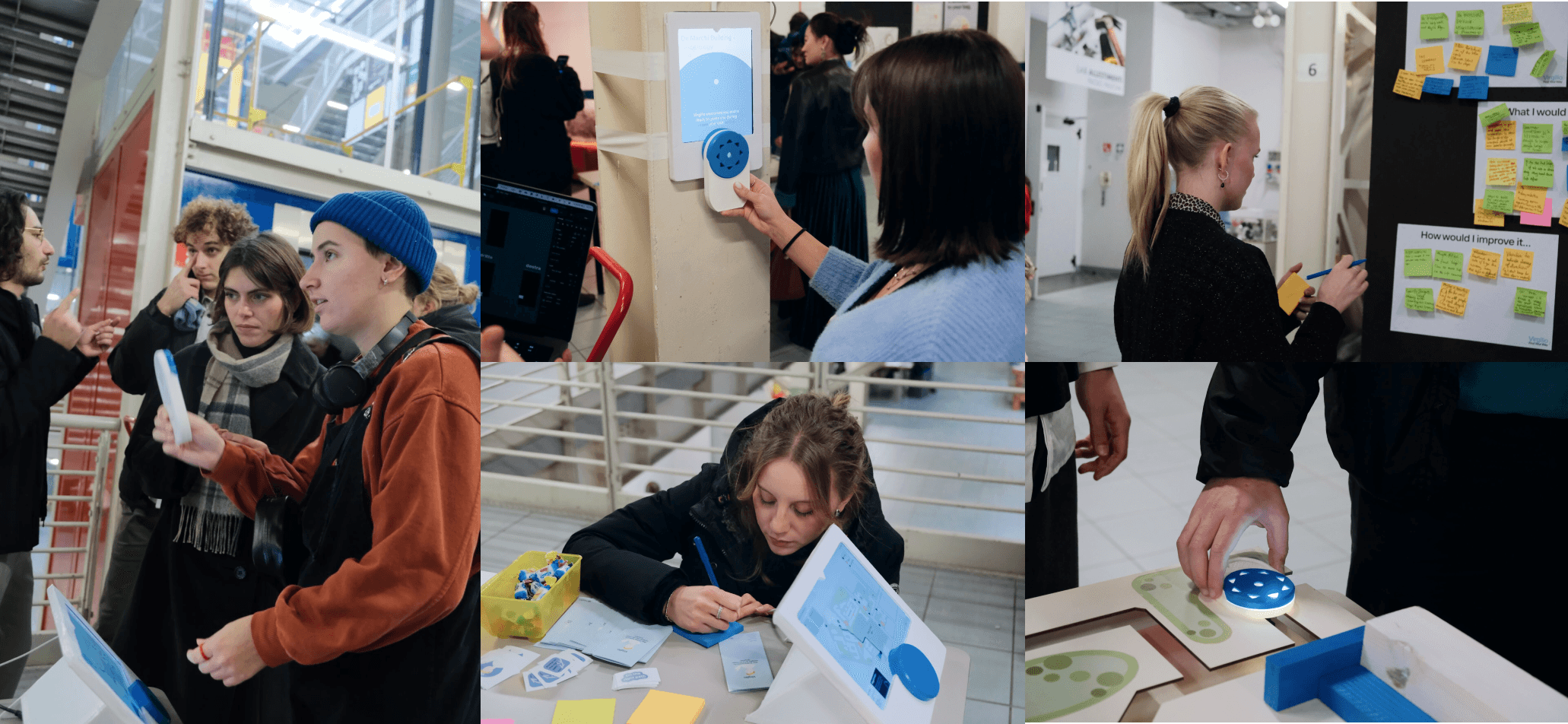
At this stage, we organised an MVP showcase session within our campus. A lot of design students, professors, and professionals participated in our on-site demo and gave their constructive feedbacks.
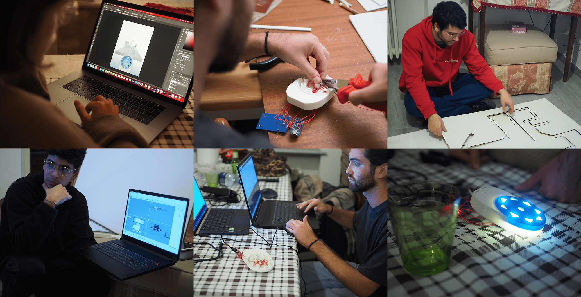
MVP Building Process
Design Showcase Day
You wonder where I am? Guess who was behind the lens ;)
Iterated Final Version
Based on feedback collected from the MVP showcase day, we conducted a final round of iteration, to further enhance the user experience. There is no end to approach perfection in design!
Reflections
Problems Encountered & How I Solved:
Collaborate in context of local language: As the only non-Italian speaker in an Italian-focused project, I felt limited in user interviews and testing, so I shifted my focus to the technical and systematic aspects of the product. I also took the initiative to document the project and frequently sought explanations to stay on track.
Mess in project management: In a team of 6 designers without a designated leader, we faced difficulty in allocating work and making decisions. In this case, I effectively pushed the progress by always break down and specify tasks to be done and proposed task claiming.
Key Learnings:
Importance of correct user & environment: We tested in wrong environment and users at the beginning, while we switched to real environment and target users later, leading to way more referable insights.
Take cost into consideration: Even though the design outcome will stay at the concept level, our design mindset was based on reality. The iterations are mainly for lowering down the cost of product components so that the proposal is more realistic to be implemented.
Next Step:
Include haptic feedback in VCompass: We received feedback about the necessity of including haptic feedback (vibration) for reminder of destination arrival & wrong path.
Design the VCompass dispenser: Even though it doesn't play an essential role in the user journey, it is still a necessary part of the entire solution.
Thanks everyone in my team, our collective contribution make this project a meaningful success💪!
👵 Summary:
The aging population in European countries has led to a surge in elderly patients in hospitals. Currently, the map and signage system in hospitals is confusing for them, resulting in insecure experience and increased workload for hospital staff and volunteers.
Virgilio, an accessible digital way-finding system, tackles this problem by offering a VCompass with an RFID chip linked to personal medical data. Users can visualize routes on VMaps outdoors and confirm directions indoors by tapping on VPoints. This streamlined and personalised navigation experience alleviates anxiety for elderly patients and ensures timely information and feedback, reducing the burden on hospital staff and providing a sense of security.
This project has been nominated in UX Design Awards 2024 and shortlisted (300 out of 7070) in IF Student Design Award 2024.
P.S: If you wish to try the prototype from the button at the left, please switch the scale into 'Fit Screen'.
Process Overview
Video
The Problem is…
Aging population is a real trend in European Union. By 2060 the EU is projected to decrease from having 4 working-age people for every person aged over 65 to about 2. It is expected to have more and more elderly patients visiting hospitals alone, while the current way-finding system in hospitals is not always user-friendly for them.
We took Polyclinic of Milan as a typical reference and conducted a comprehensive site investigation.
We discovered that in the current way-finding system, the displayed information is not always understandable, and different touch points are not connected, leading to the elderly patients to...
User Research
To understand the pains experienced by both the patients and hospital staff in detail, we conducted 7 in-depth interviews and 4 shadowing sessions.
Discovery
As a result, we synthesised our first-hand research findings into 4 key discoveries:
The current signage system is not friendly for the elderly patients, leading to the necessity of asking hospital staff.
The digital devices in the hospital are not user-friendly enough for the elderly patients, leading to distrust and reliance on asking.
Patients are also not about to get 100% correct answers through asking, a lot of extra time and efforts are spent in 'trial and error'.
Patients can still complete the process successfully, while the process might be troublesome and frustrating.
Persona
We synthesised our research discoveries into a typical user - Giovanna, who is a 79-year-old lady who needs to visit hospital frequently due to diabetes. Her route of hospital visit is also extracted to clearly visualise when and where may she need help in Polyclinic of Milan.
Design Concept
Through research, we identified the main user emotion during this hospital visit journey as ‘frustration’, and we aim to reframe it to ‘trust’.
We envisioned an accessible, informative, and streamlined solution.
Design Iterations
Overview
To enable these design considerations as well as taking the technical feasibility into account, we quickly prototyped, tested, and iterated our design proposals for 3 main rounds, with increased balance of user experience and technical possibility.
Iteration 1
Iteration 2
Iteration 3
Design Version 1
Within a designated time frame, we synthesised our design into a version that has a satisfactory balance between user-friendliness, field feasibility, and technical complexity.
MVP Showcase and Testing
At this stage, we organised an MVP showcase session within our campus. A lot of design students, professors, and professionals participated in our on-site demo and gave their constructive feedbacks.
MVP Building Process
Design Showcase Day
You wonder where I am? Guess who was behind the lens ;)
Iterated Final Version
Based on feedback collected from the MVP showcase day, we conducted a final round of iteration, to further enhance the user experience. There is no end to approach perfection in design!
Reflections
Problems Encountered & How I Solved:
Collaborate in context of local language: As the only non-Italian speaker in an Italian-focused project, I felt limited in user interviews and testing, so I shifted my focus to the technical and systematic aspects of the product. I also took the initiative to document the project and frequently sought explanations to stay on track.
Mess in project management: In a team of 6 designers without a designated leader, we faced difficulty in allocating work and making decisions. In this case, I effectively pushed the progress by always break down and specify tasks to be done and proposed task claiming.
Key Learnings:
Importance of correct user & environment: We tested in wrong environment and users at the beginning, while we switched to real environment and target users later, leading to way more referable insights.
Take cost into consideration: Even though the design outcome will stay at the concept level, our design mindset was based on reality. The iterations are mainly for lowering down the cost of product components so that the proposal is more realistic to be implemented.
Next Step:
Include haptic feedback in VCompass: We received feedback about the necessity of including haptic feedback (vibration) for reminder of destination arrival & wrong path.
Design the VCompass dispenser: Even though it doesn't play an essential role in the user journey, it is still a necessary part of the entire solution.
Thanks everyone in my team, our collective contribution make this project a meaningful success💪!