🧑💼 Summary:
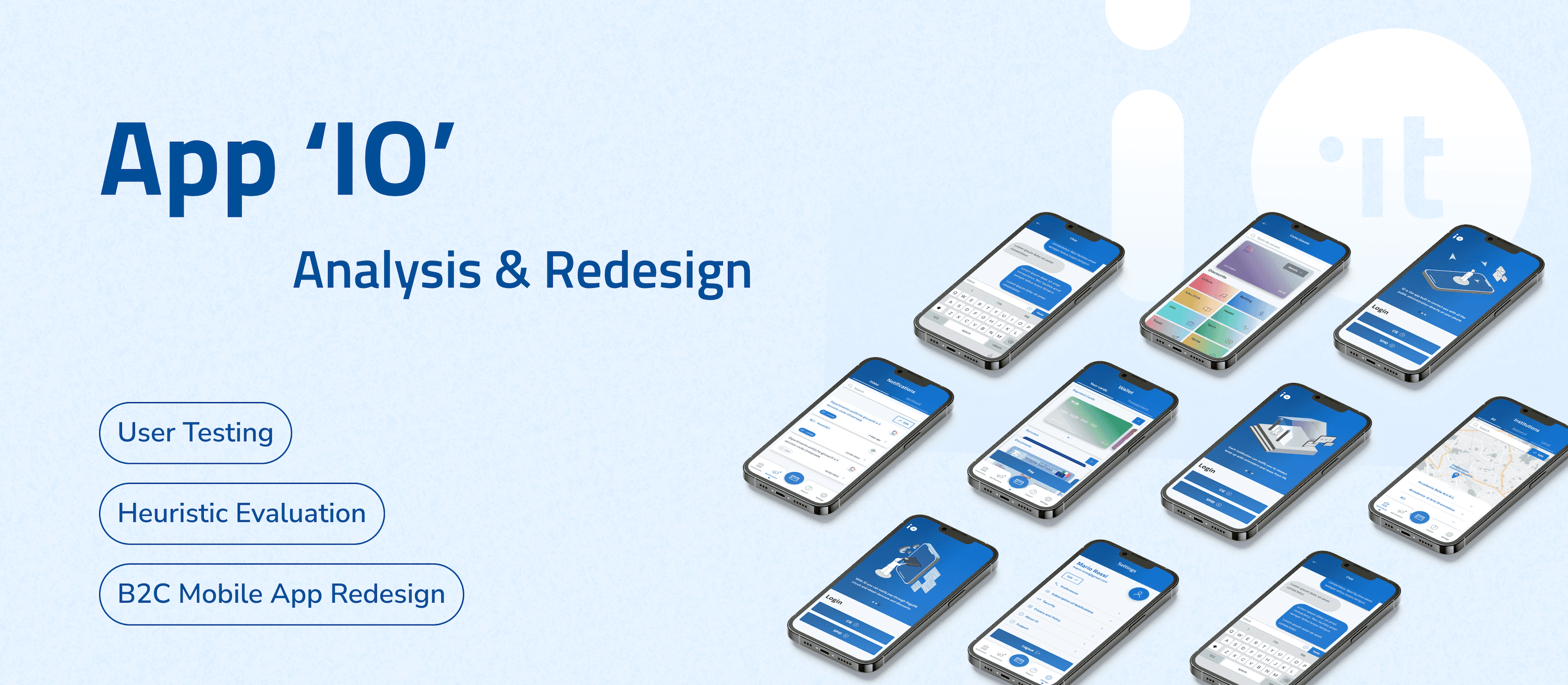
App 'IO' is a mobile app that allows users to access Italian local and national public services.
Currently the design of App 'IO' cannot serve its core usage scenarios at its best: some navigation paths are frustrating and some information displayed are confusing, leading to frequent errors during usage. This project reframes the entire application from scratch, from problem probing, restructuring, to interface visual upgrading. The process involves highly solid and structural design research methodologies.
The final design delivery not only largely improves functional usability, but also enhances emotional experience. If you are interested in the prototype, please access from the button at the left:)
Process Overview
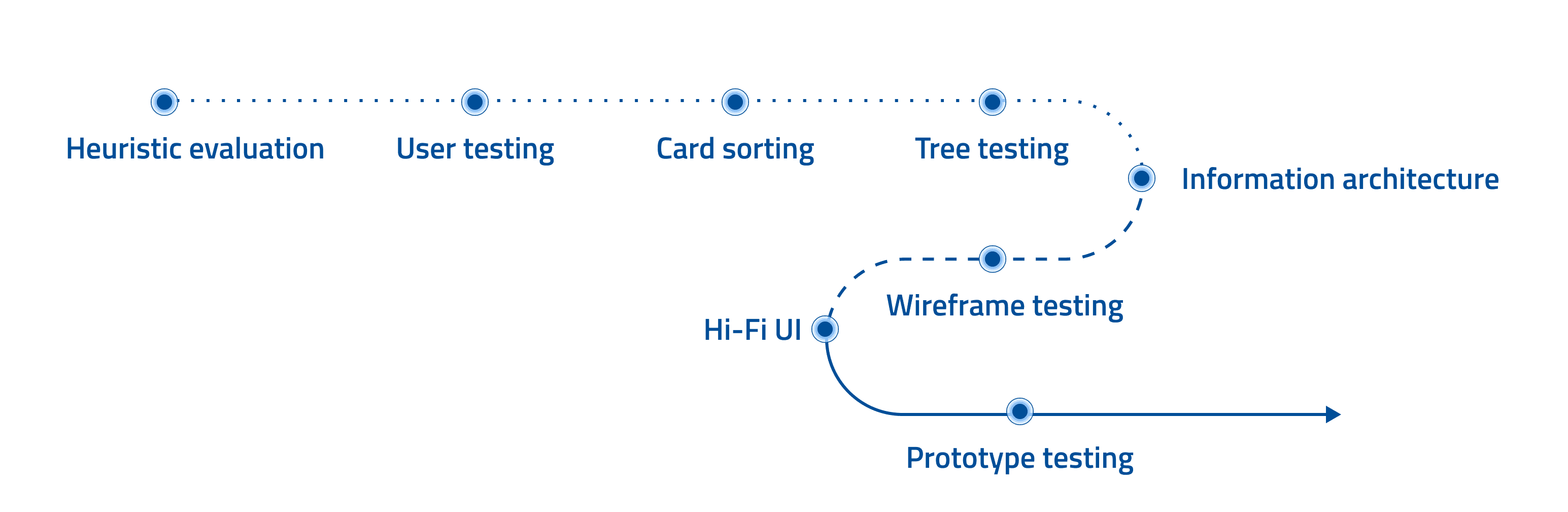
Context
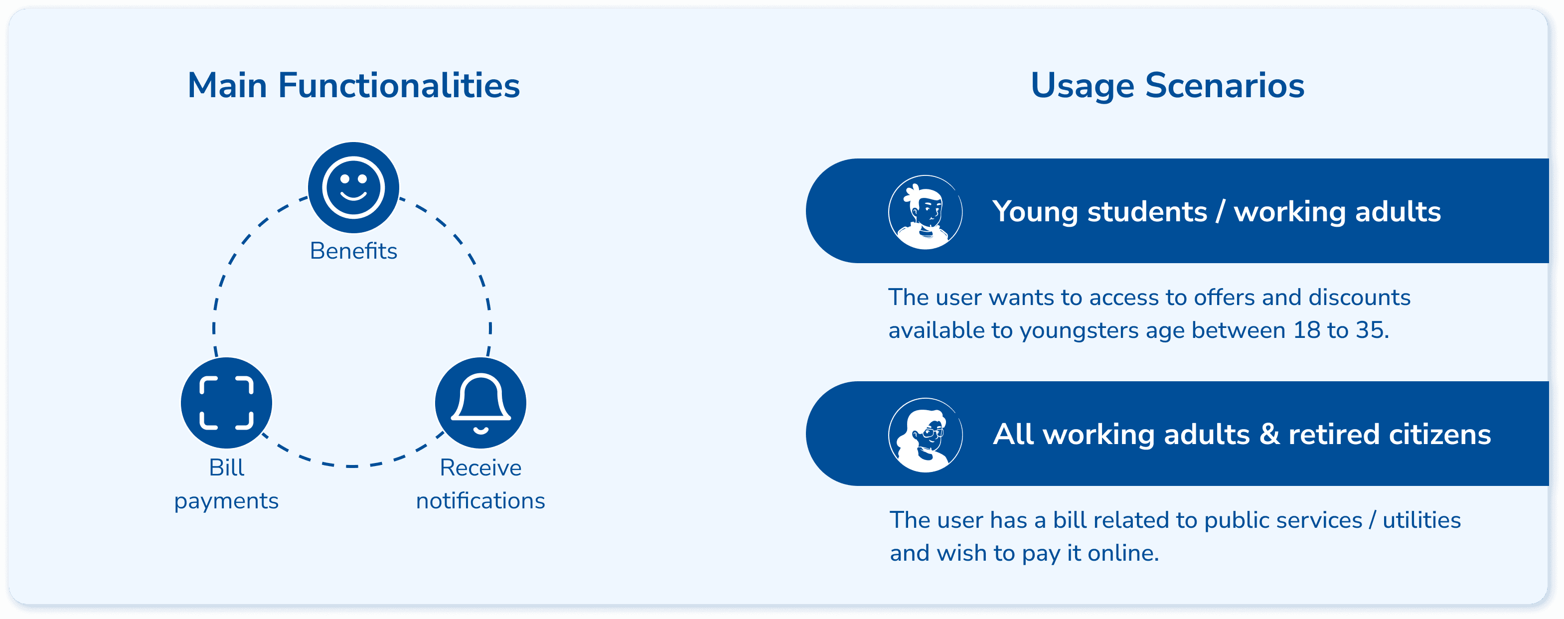
App ‘IO’ is an Italian integrated public service platform. It provides a single point of access to interact with local and national public services easily. In essence, based on its 3 core functionalities, it targets 2 main user groups and their corresponding distinctive usage scenarios.
Stage 1: Structure Reframing
Heuristic Evaluation
To evaluate the overall usability, our team (5 designers all considered as expert users) adopted the Jacob Nielsen heuristic evaluation method. The following steps were conducted as the main part of the process:
Identify which heuristic has been violated
Describe the issue in detail
Rate severity level
Brainstorm possible solutions as recommendations
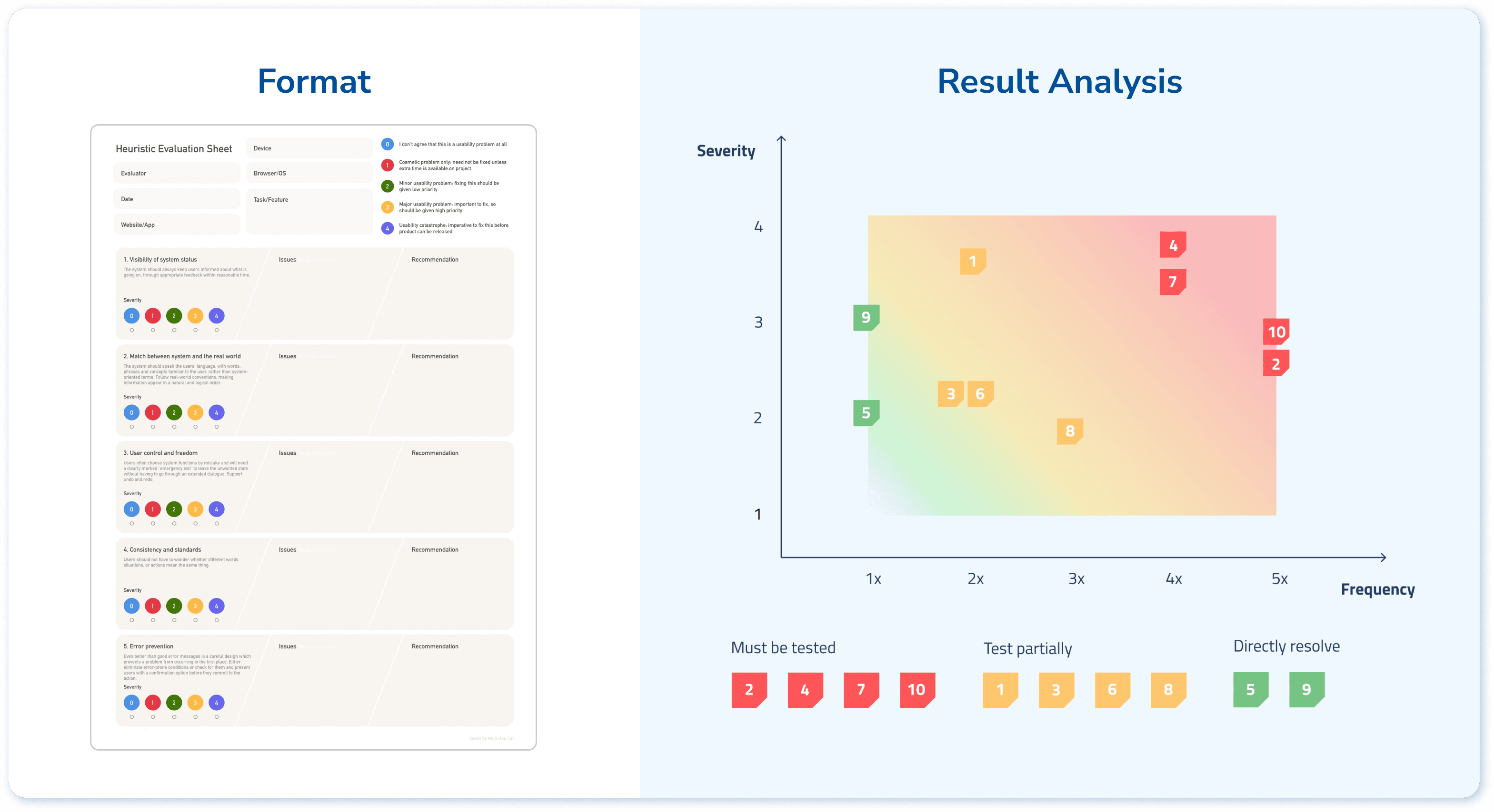
To make strategic decision about next step, I mapped the data collected out in terms of times of identification (frequency) and severity level, which allows us to identify the serious ones that are worth of testing within limited timeframe.
User Testing
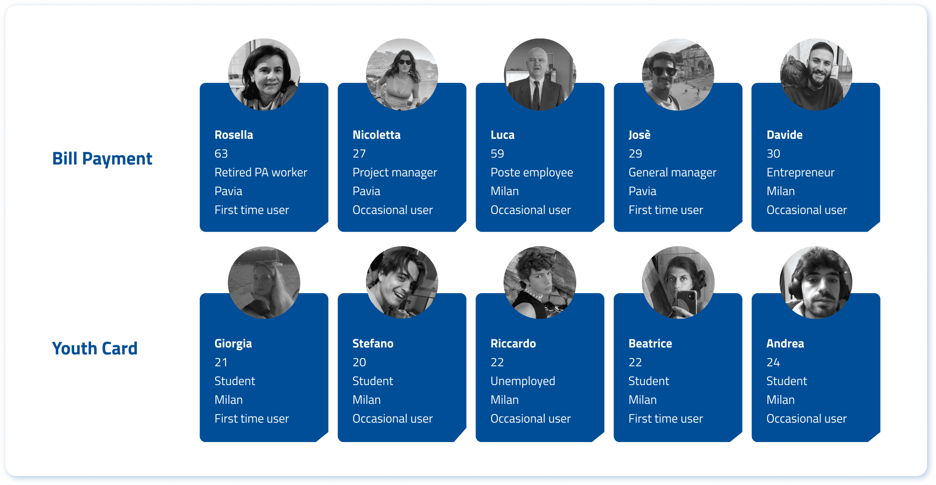
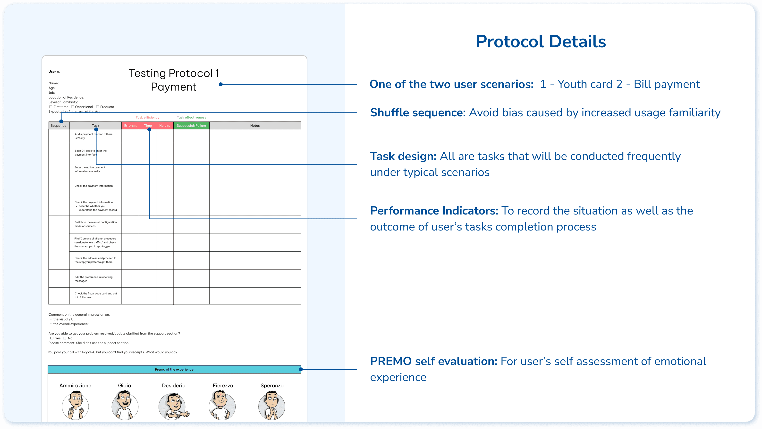
Based on the 2 typical user scenarios, the testing protocol is designed with 9 related tasks to evaluate the effectiveness, efficiency, and satisfaction of the user experience. We tested with 5 users in each scenario, with a mixture of first time users and occasional users.
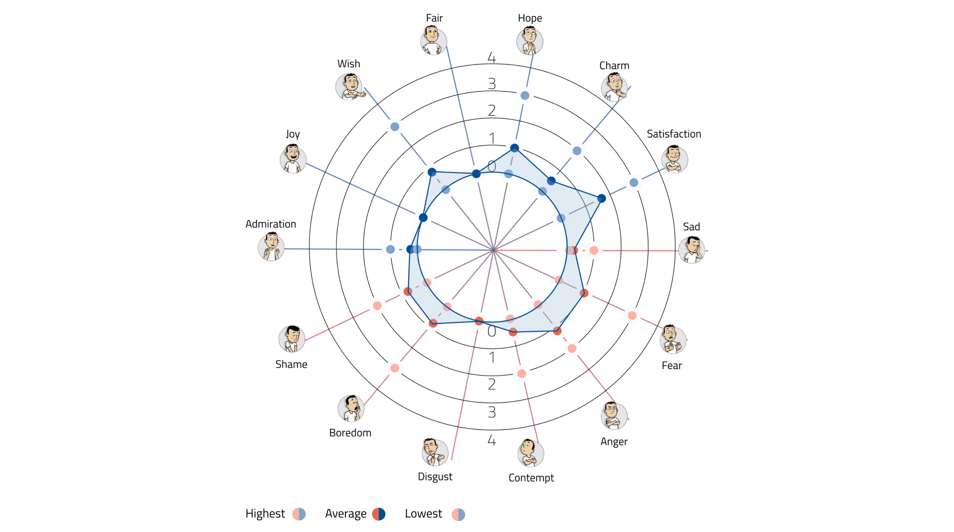
Based on the quantitative result, we discovered the pattern of users’ emotions, and the following design briefs are summarised:
Less Information Overload: By reducing and synthesising the amount of informations displayed while also following a clear and relevant hierarchy.
Intuitive Communication: By having more consistent affordances like icons, signifiers and patterns to better guide the user through the app.
Straightforward Task Flow: By having a clearer and more structured information architecture that displays all the functionalities of the app in a clear and immediate way.
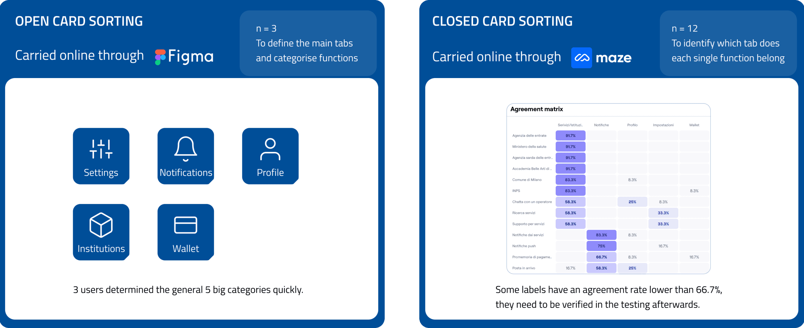
From Open to Closed Card Sorting
To reorganise the whole structure, open and closed card sorting sessions were conducted to figure out the pattern of users’ intuition.
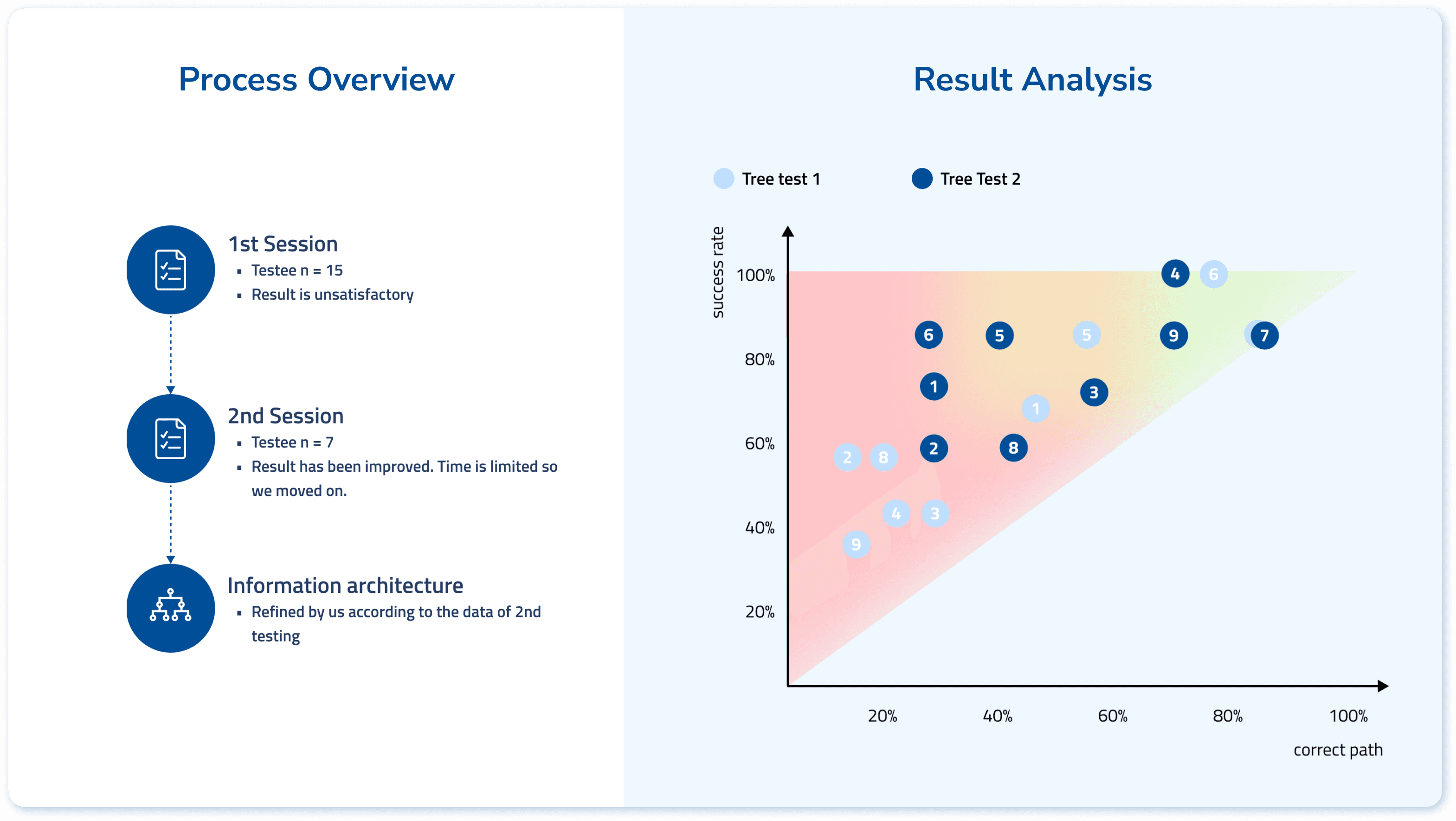
From Tree Testing to Information Architecture
The main goal is to verify the labels that are considered controversial in the card sorting sessions. We defined 9 user tasks that are highly relevant to the two main scenarios. We iterated the 'structure tree' for 2 rounds to define the information architecture.
Stage 2: Wireframe Testing
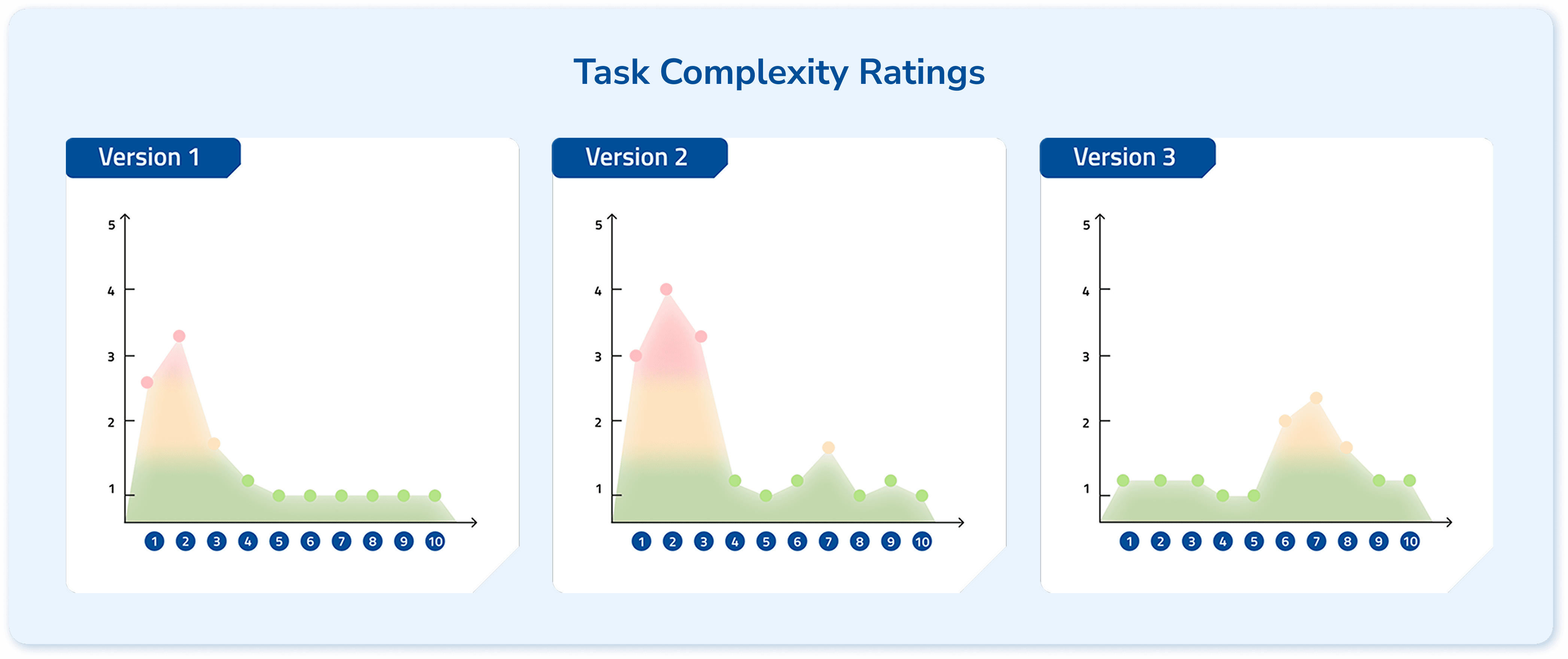
According to the defined information architecture, we prepared two versions of wireframes to compare their performance and synthesized the best practices into a final 3rd version. The testing protocol was the same as stage one, since the essential tasks are the same.
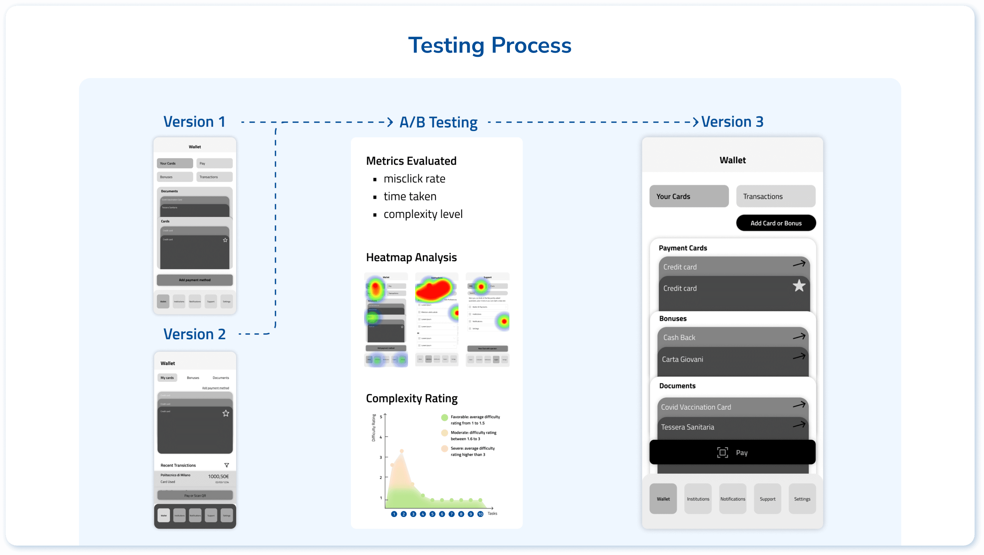
From Version 1 & 2 to Version 3, we eliminated problematic tasks, indicating effective iteration.
Stage 3: High-fidelity Prototype
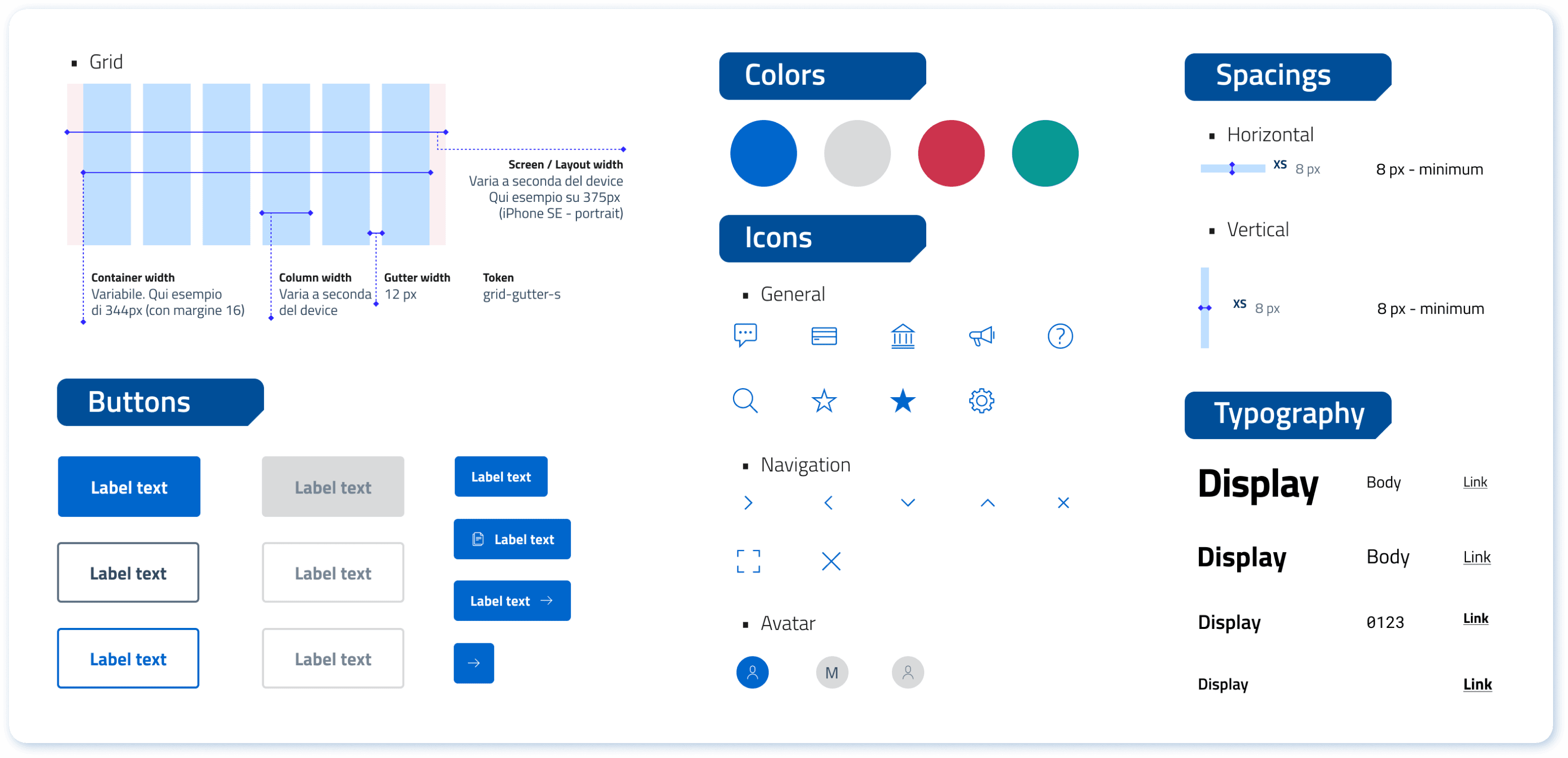
Style Guide
Since currently the App is using an existing mature design system made by Designers Italia, we decided not to create a new one but generally extracted the usable parts.
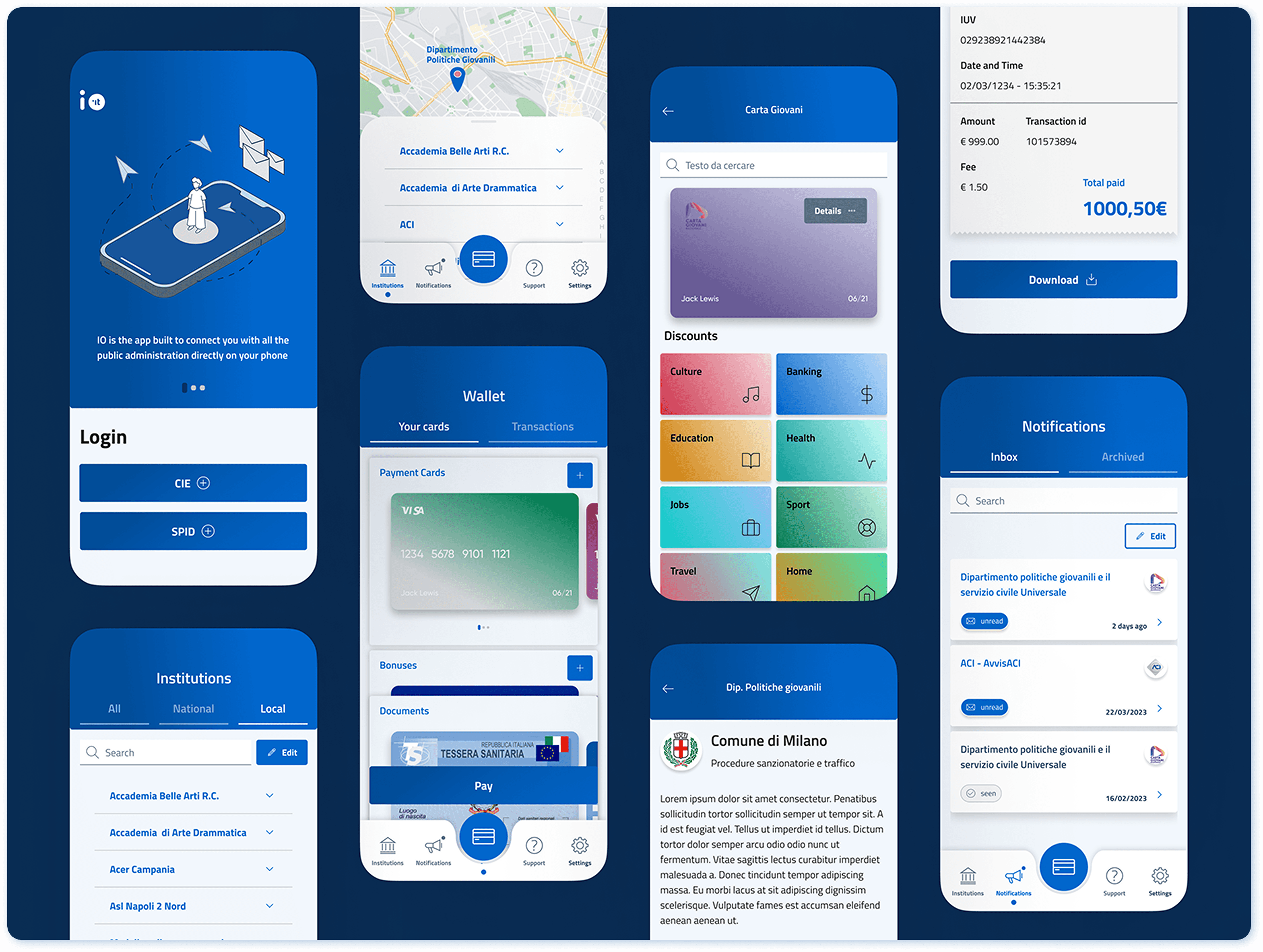
UI Prototype
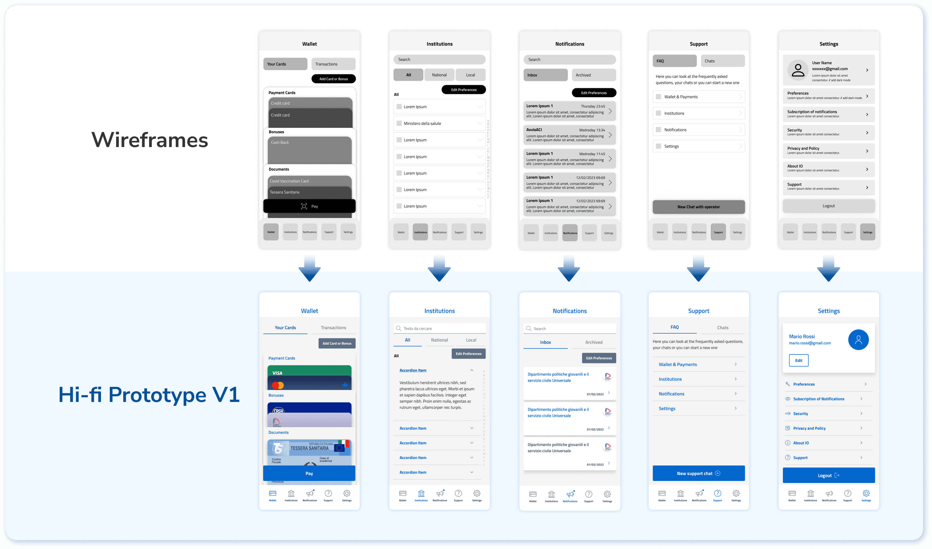
Based on the final version of wireframe, the first version of hi-fidelity prototype is directly obtained, just by colouring the wireframe.
After the testing, based on the feedback collected, we upgraded the visual to make the experience more pleasant.
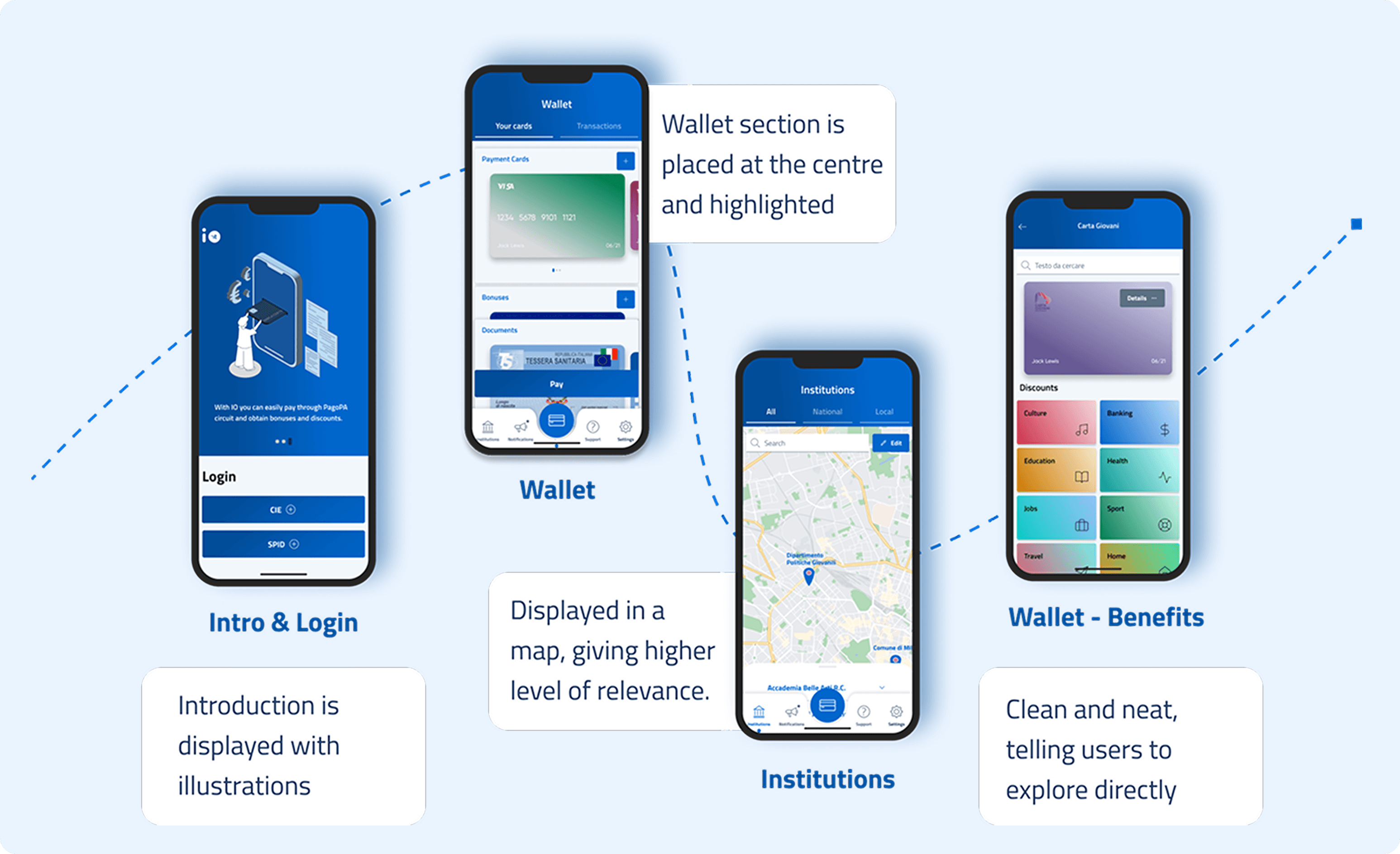
Comparing with the original version, the redesigned version excels in:
Higher visual quality
More intuitive task completion path
Lower information / cognition load
Emphasising the most frequent user tasks
An integrated and easy-to-find ‘support’ section
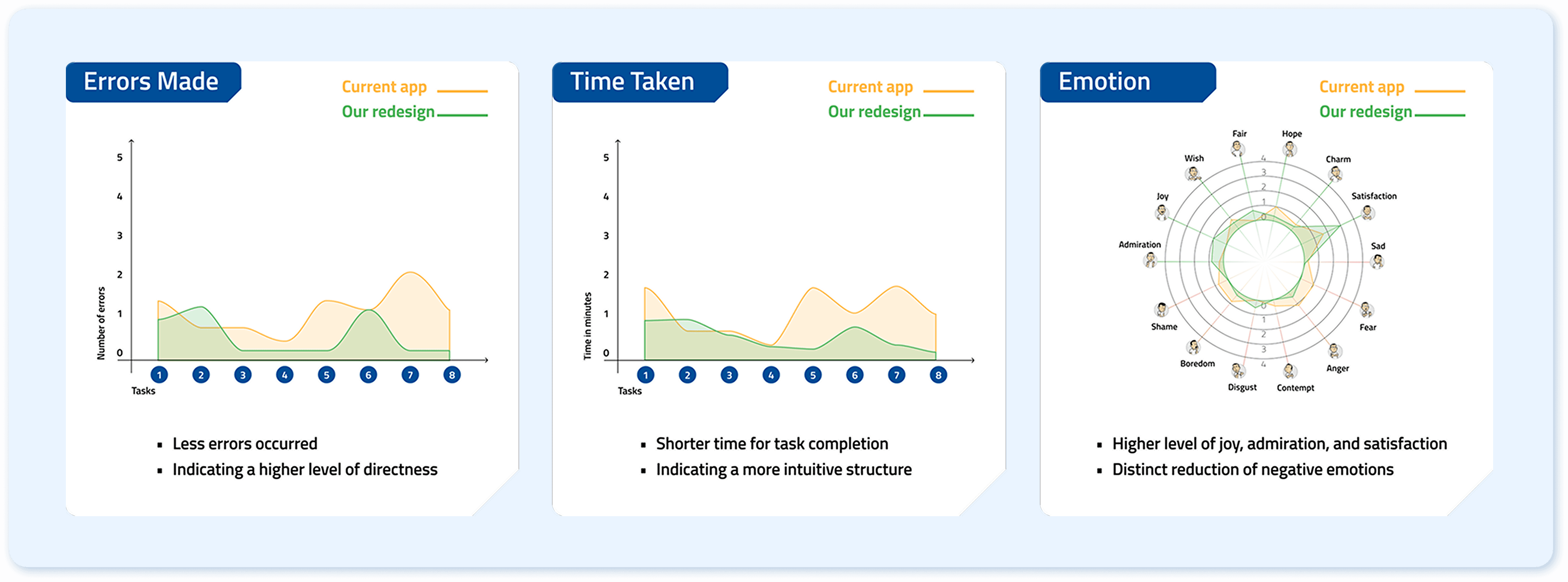
Final Testing & Measure Success
With the completion of final prototype, we conducted a final round of testing and compared testing result with the the initial user testing from the old version. The data has confirmed that our redesign has been effective in improving both usability and user experience.
Take the first scenario ‘Bill Payment’ as example:
Reflections
Problems Encountered & How I Solved
Mess in project management: We are a team of 5 designers while we needed to complete this project in a very tight time frame. As the target users are Italians but I don't have Italian proficiency, I proposed to make result analysis and data visualisation to ensure seamless collaboration.
Difficulty in decision making: During interface design, we came up with multiple versions that made us hard to choose. In this sense, I suggested the team to discuss about pros and cons of each version and prioritise certain factors.
Key Learnings
Users' intuition brings design implications: In the original version, user’s health card, covid certificate, and youth card are put in different sections that require users to remember the route of finding them seperately. However, users expressed ‘they are all my personal cards and documents’ in the interview, inspiring us to integrate them to give user less cognitive load.
Phrasing of user testing tasks: Earlier in testing, we noticed many users didn’t follow the intended route to complete the task directly but instead used the search bar as an indirect solution. We realized this was due to the frequent use of the word "search" in the task description, which caused confusion. This highlights the importance of carefully phrasing questions and tasks to avoid misinterpretation.
Next Step
Define most efficient track for 'notification settings;: During user testing sessions, we discovered that users still struggled to find where to edit the notifications sent from institutions. It seems to be relevant to ‘institutions’, ‘notifications’, and ‘settings’ all three parts. Currently in our version we introduced intended redundancy to allow users to edit from all these tabs.
🧑💼 Summary:
App 'IO' is a mobile app that allows users to access Italian local and national public services.
Currently the design of App 'IO' cannot serve its core usage scenarios at its best: some navigation paths are frustrating and some information displayed are confusing, leading to frequent errors during usage. This project reframes the entire application from scratch, from problem probing, restructuring, to interface visual upgrading. The process involves highly solid and structural design research methodologies.
The final design delivery not only largely improves functional usability, but also enhances emotional experience. If you are interested in the prototype, please access from the button at the left:)
Process Overview
Context
App ‘IO’ is an Italian integrated public service platform. It provides a single point of access to interact with local and national public services easily. In essence, based on its 3 core functionalities, it targets 2 main user groups and their corresponding distinctive usage scenarios.
Stage 1: Structure Reframing
Heuristic Evaluation
To evaluate the overall usability, our team (5 designers all considered as expert users) adopted the Jacob Nielsen heuristic evaluation method. The following steps were conducted as the main part of the process:
Identify which heuristic has been violated
Describe the issue in detail
Rate severity level
Brainstorm possible solutions as recommendations
To make strategic decision about next step, I mapped the data collected out in terms of times of identification (frequency) and severity level, which allows us to identify the serious ones that are worth of testing within limited timeframe.
User Testing
Based on the 2 typical user scenarios, the testing protocol is designed with 9 related tasks to evaluate the effectiveness, efficiency, and satisfaction of the user experience. We tested with 5 users in each scenario, with a mixture of first time users and occasional users.
Based on the quantitative result, we discovered the pattern of users’ emotions, and the following design briefs are summarised:
Less Information Overload: By reducing and synthesising the amount of informations displayed while also following a clear and relevant hierarchy.
Intuitive Communication: By having more consistent affordances like icons, signifiers and patterns to better guide the user through the app.
Straightforward Task Flow: By having a clearer and more structured information architecture that displays all the functionalities of the app in a clear and immediate way.
From Open to Closed Card Sorting
To reorganise the whole structure, open and closed card sorting sessions were conducted to figure out the pattern of users’ intuition.
From Tree Testing to Information Architecture
The main goal is to verify the labels that are considered controversial in the card sorting sessions. We defined 9 user tasks that are highly relevant to the two main scenarios. We iterated the 'structure tree' for 2 rounds to define the information architecture.
Stage 2: Wireframe Testing
According to the defined information architecture, we prepared two versions of wireframes to compare their performance and synthesized the best practices into a final 3rd version. The testing protocol was the same as stage one, since the essential tasks are the same.
From Version 1 & 2 to Version 3, we eliminated problematic tasks, indicating effective iteration.
Stage 3: High-fidelity Prototype
Style Guide
Since currently the App is using an existing mature design system made by Designers Italia, we decided not to create a new one but generally extracted the usable parts.
UI Prototype
Based on the final version of wireframe, the first version of hi-fidelity prototype is directly obtained, just by colouring the wireframe.
After the testing, based on the feedback collected, we upgraded the visual to make the experience more pleasant.
Comparing with the original version, the redesigned version excels in:
Higher visual quality
More intuitive task completion path
Lower information / cognition load
Emphasising the most frequent user tasks
An integrated and easy-to-find ‘support’ section
Final Testing & Measure Success
With the completion of final prototype, we conducted a final round of testing and compared testing result with the the initial user testing from the old version. The data has confirmed that our redesign has been effective in improving both usability and user experience.
Take the first scenario ‘Bill Payment’ as example:
Reflections
Problems Encountered & How I Solved
Mess in project management: We are a team of 5 designers while we needed to complete this project in a very tight time frame. As the target users are Italians but I don't have Italian proficiency, I proposed to make result analysis and data visualisation to ensure seamless collaboration.
Difficulty in decision making: During interface design, we came up with multiple versions that made us hard to choose. In this sense, I suggested the team to discuss about pros and cons of each version and prioritise certain factors.
Key Learnings
Users' intuition brings design implications: In the original version, user’s health card, covid certificate, and youth card are put in different sections that require users to remember the route of finding them seperately. However, users expressed ‘they are all my personal cards and documents’ in the interview, inspiring us to integrate them to give user less cognitive load.
Phrasing of user testing tasks: Earlier in testing, we noticed many users didn’t follow the intended route to complete the task directly but instead used the search bar as an indirect solution. We realized this was due to the frequent use of the word "search" in the task description, which caused confusion. This highlights the importance of carefully phrasing questions and tasks to avoid misinterpretation.
Next Step
Define most efficient track for 'notification settings;: During user testing sessions, we discovered that users still struggled to find where to edit the notifications sent from institutions. It seems to be relevant to ‘institutions’, ‘notifications’, and ‘settings’ all three parts. Currently in our version we introduced intended redundancy to allow users to edit from all these tabs.